


Name - AI Healthcare SaaS Dashboard
PROJECT OVERVIEWThis project focused on designing a high-converting landing page for an AI-powered smart banking app that transforms how users manage their finances. By combining advanced AI capabilities—such as predictive forecasting, conversational assistance, and hyper-personalized insights—with a clear, human-centered experience, the goal was to bridge the gap between complex technology and everyday usability.
The result is a conversion-driven landing page that builds trust, simplifies financial decision-making, and positions the product as a proactive financial partner rather than a passive tool.
❋ IndustryFintech
AI-Powered Digital Banking
❋ PlatformResponsive Web
(Landing Page, Mobile-first)
❋ ServicesUX Strategy
UX Research
Information Architecture
Wireframing
UI Design
Visual Design
Conversion Rate Optimization (CRO)
❋ ToolsGoogle Analytics
Hotjar
Figma
FigJam

PROBLEMDespite the rapid evolution of fintech, most digital banking experiences remain reactive, manual, and difficult to navigate. While AI introduces powerful capabilities, it also creates new layers of complexity that users struggle to understand and trust.
Key challenges identified:
AI features feel abstract and disconnected from real-life needs
Users are unsure how these tools actually improve their financial decisions
Concerns around privacy and security increase hesitation
Financial management still feels effort-heavy rather than simplified
Although the product offers advanced capabilities—such as forecasting, automation, and personalization—the perceived value is not immediately clear.
SOLUTIONThe solution was to design a landing page that reframes AI as a human, supportive experience, positioning the product as an intelligent financial companion rather than a technical tool.
Key design approach:
Translate each AI capability into a clear, real-life benefit
Position the product as a Smart Financial Assistant
Build trust through consistent, transparent communication
Guide users through a structured, conversion-focused journey
Instead of focusing on how the technology works, the experience emphasizes what users can achieve with it—such as saving effortlessly, avoiding financial risks, and making confident decisions.
Insight-Driven Foundations (UX Research)
To ensure the experience was grounded in real user behavior and expectations, research focused on understanding how people perceive both financial tools and AI-driven products. This included analyzing competitor platforms, reviewing user behavior patterns (such as scroll depth and drop-off points), and identifying common friction areas in fintech onboarding and landing page experiences.
A key observation was that users approach financial products with a mix of skepticism and emotional sensitivity.
Money is inherently tied to stress, control, and trust — which means any added layer of complexity, like AI, can either feel empowering or overwhelming depending on how it is presented.
Another important finding was that users rarely engage with features they don’t immediately understand. When value is unclear, users tend to disengage quickly, especially on landing pages where attention spans are short and expectations are high.
Key Insights
Users care less about AI and more about what it helps them achieve in real life
Financial anxiety plays a major role in decision-making and adoption
Trust must be introduced early and reinforced throughout the experience
Personalized experiences feel more relevant and useful, which naturally encourages users to engage more with the product
Simple, clear interfaces make products feel more trustworthy and reliable — while overly complex designs can create doubt and hesitation
Simplifying Complexity (Wireframing)
Wireframes focused on:
Breaking down AI features into clear, digestible sections
Reducing cognitive load through spacing and hierarchy
Positioning CTAs after key value moments
Ensuring a smooth, predictable scroll experience
The goal was to make complex functionality feel effortless.
User
Personas

User Name
Clinician (Primary User)Needs quick insights during patient care
Values speed, clarity, and reliability
“These dashboards show everything… and that’s exactly
the problem. If I have to dig, I’m already losing time.”

Healthcare AdministratorEmmet Marsh
Focuses on operational efficiency
Needs aggregated data and trends
“I don’t need all the data
— I need the right data, fast.”

🧠 Key Insights, Backed by Real User Signals
🧠 Key Insights, Backed by Real User Signals
The UX research phase uncovered critical behavioral patterns and needs that directly shaped the product’s structure, interactions, and AI integration. These insights were translated into design decisions across the platform to ensure the experience supports speed, clarity, and trust in high-pressure healthcare environments.
Key Learnings
AI is only valuable if it’s understandable
In healthcare, trust > innovation
Designing for urgency requires extreme clarity
Actionable insights outperform raw data
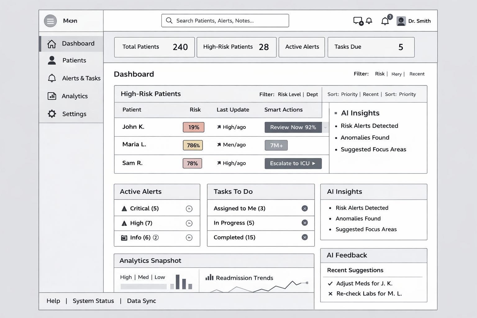
Clarity Over Completeness
Applies To: Dashboard → Overview | Patients → Patient List
Users consistently favored simplified, prioritized information over dense data displays
Complex charts and large datasets were often ignored in time-sensitive scenarios
How We Addressed It:
High-risk patients and alerts surfaced prominently on the Dashboard
Use of AI summaries and strong visual hierarchy to reduce noise
Progressive disclosure to reveal details only when needed
Need for Scan-Friendly Interfaces
Applies To: Dashboard | Alerts & Tasks | Patients → List
Clinicians interact with interfaces in quick-glance patterns
Critical information must be understood within seconds
How We Addressed It:
Card-based layout with clear separation of content
Color-coded risk indicators (red / yellow / green)
Minimal text, high signal-to-noise ratio
Key data placed above the fold
Trust in AI Requires Transparency & Control
Applies To: Patients → Patient Detail | Smart Actions (Dashboard & Patient List)
Users expressed skepticism toward AI without clear reasoning
Confidence increased when AI outputs were explainable and verifiable
How We Addressed It:
Integration of Explainable AI modules (“Why this action?”)
Display of confidence scores and contributing factors
Ability to validate and act on recommendations with context
Decision-Making Under Time Pressure
Applies To: Dashboard → High-Risk Patients | Alerts & Tasks
Users operate under extreme time constraints
Decision-making must be fast, direct, and actionable
Design Response:
Introduction of Smart Actions (AI-powered CTAs)
Task-based alerts with clear prioritization
Reduced steps between identifying an issue and taking action
Need for Both Clinical and Operational Visibility
Applies To: Analytics → Predictive Insights
Different user roles require different levels of insight
Clinicians focus on patients; admins focus on trends and performance
Design Response:
Dedicated Analytics section for:
Predictive trends
Resource allocation
Population-level insights
Fragmentation of Patient Data
Applies To: Patients → Patient Detail
Clinicians struggled with disconnected systems and scattered data
Required multiple tools to get a complete patient view
Design Response:
Unified Patient Detail view with:
Summary | Vitals | Timeline & AI insights
Centralized access to all relevant patient information
“The UX research shifted the product from a data-heavy system to an insight-driven experience—where clarity, speed and trust are not features, but foundational design principles.”
Post-Research Design Decisions
Following the research phase, design decisions focused on translating user needs into a clear, fast, and trustworthy experience. The interface prioritizes high-risk information, uses a scan-friendly layout, and integrates AI in a way that supports—rather than replaces—clinical judgment. By combining strong visual hierarchy, simplified data presentation, and explainable AI features, the design reduces cognitive load while enabling quicker, more confident decision-making.
Visual Identity

AI Features & Integration (Mapped to Product Structure)
Smart Actions (AI-Powered CTAs)
Applies To: Dashboard → High-Risk Patients | Patients → Patient List
Dynamic, context-aware actions displayed per patient
Replaces static buttons with AI-recommended next steps
Includes priority level and confidence score
How It Helps:
Surfaces the next-best action exactly where clinicians are prioritizing patients, reducing decision time and cognitive load.
Explainable AI (Trust Layer)
Applies To: Patients → Patient Detail | Dashboard (expandable modules)
“Why this action?” expandable explanations
Displays contributing factors (vitals, history, anomalies)
Shows confidence levels and reasoning
How It Helps:
Provides the context needed to validate AI recommendations, increasing trust and supporting confident decision-making.
Patient Risk Scoring
Applies To: Dashboard → Overview | Patients → Patient List | Patient Detail
Real-time AI-generated risk levels (High / Medium / Low)
Visual indicators (color-coded + labels)
Continuously updated based on live data
How It Helps:
Enables quick scanning and consistent prioritization across the platform, ensuring high-risk patients are never overlooked.
Predictive Analytics & Insights
Applies To: Analytics → Predictive Insights
Forecasts trends (e.g., readmissions, risk distribution)
Identifies patterns across patient populations
Suggests operational improvements
How It Helps:
Supports long-term planning and resource optimization by turning data into actionable strategic insights.
AI-Powered Alerts & Escalations
Applies To: Alerts & Tasks → Alerts
Automatically triggers alerts based on risk thresholds
Prioritizes alerts by severity
Suggests escalation paths (e.g., ICU, specialist review)
How It Helps:
Ensures critical situations are flagged immediately, enabling faster response and reducing reliance on manual monitoring.
AI-Generated Patient Summaries
Applies To: Patients → Patient Detail
Summarizes patient condition, recent changes, and key risks
Highlights anomalies and critical updates
How It Helps:
Allows clinicians to understand complex patient data instantly, reducing time spent reviewing full medical histories.
From Structure to Screens: AI-Powered Design Execution
From Structure to Screens: AI-Powered Design Execution
The transition from sitemap to wireframes was guided by a combination of structured thinking and AI-powered support, ensuring both speed and consistency across the design process.
To further refine the Information Architecture, ChatGPT was used to map user journeys and suggest interaction patterns aligned with the research insights. Additionally, tools like Whimsical AI supported the creation of clear, visual sitemaps and flows, making it easier to validate structure before moving into screens. Together, these tools enabled a seamless shift from abstract structure to tangible UI, while keeping the design grounded in user needs and optimized for efficiency.
Sitemap generated after UX Research data was analyzed (Balsamiq AI)
Final Design, Backed by Data
The final designs were directly shaped by key UX research insights, translating real user needs into clear, actionable interfaces. Every layout, interaction, and AI feature was intentionally crafted to reduce cognitive load, support rapid decision-making, and build trust—ensuring the experience is not only visually effective, but grounded in real-world clinical behavior.
Sitemap generated after UX Research data was analyzed (Balsamiq AI)