Moove — Fitness & Community
for the 50+ Generation
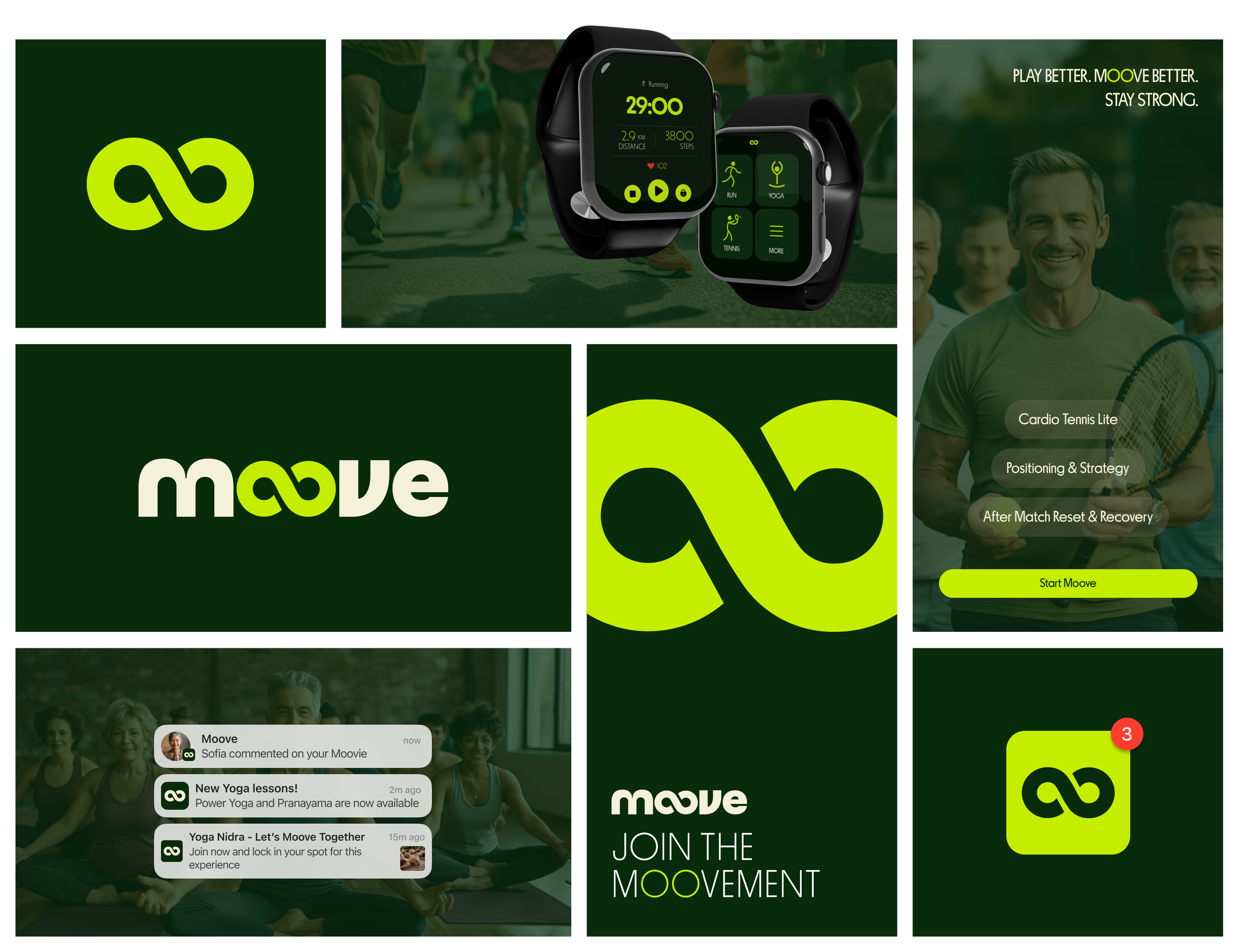
OVERVIEWMoove is a fitness and community platform designed specifically for adults 50+, helping them rediscover movement in a way that feels simple, social, and genuinely enjoyable. Instead of focusing on performance, numbers, or intensity, the project reframes fitness as a lifelong journey rooted in consistency, connection and well-being. The brand strategy centers on building healthy habits through everyday activities and shared experiences, encouraging users to stay active not by pushing limits, but by showing up — together.
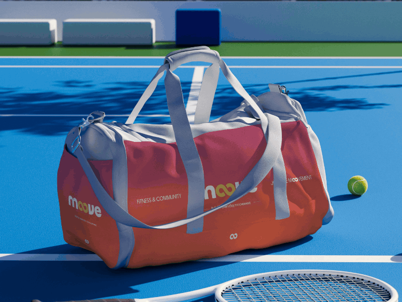
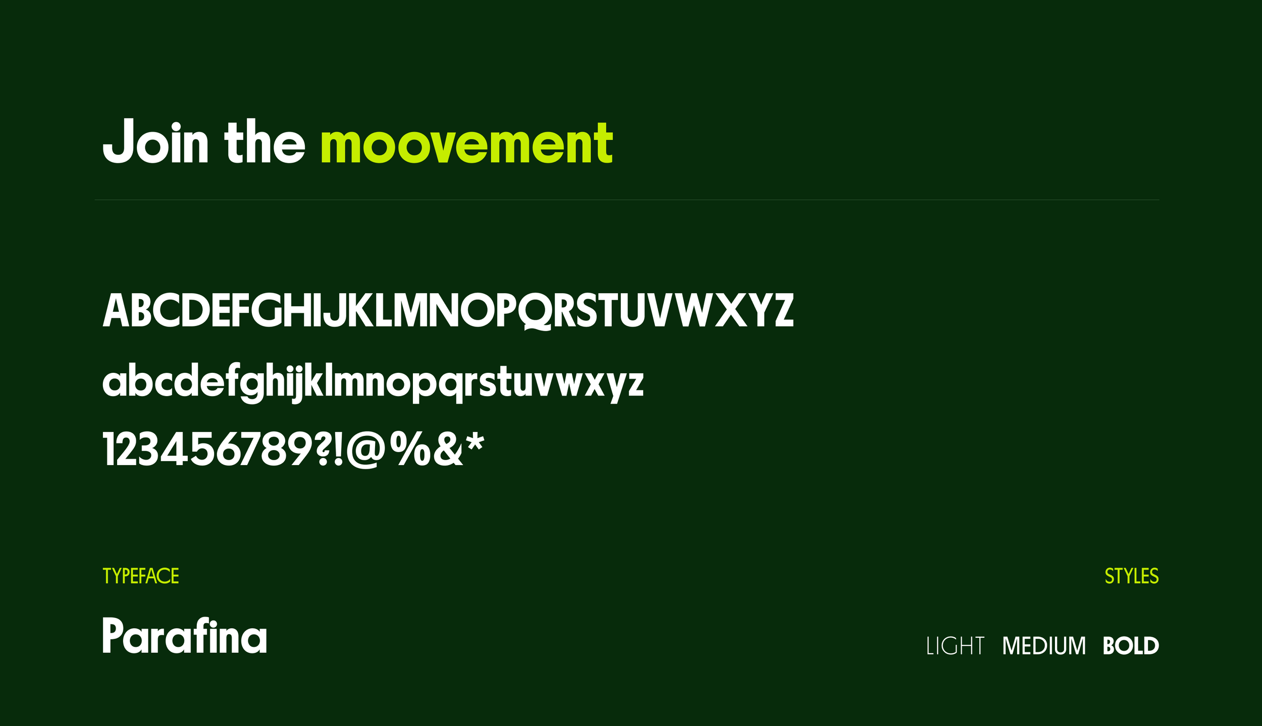
This philosophy is expressed through a bold yet human visual identity and a product experience designed with empathy. The logo’s infinity symbol, formed by the double “o”, represents continuous movement and growth, while vibrant colors, curved forms and strong typography bring energy and warmth without overwhelming the user. The interface follows a minimal, text-first approach that prioritizes clarity, accessibility and ease of use, reducing cognitive load and making interactions intuitive. Together, the branding, art direction and product design create a cohesive system that supports a 50+ audience in building sustainable habits through connection, simplicity and joy.
❋ ServicesBrand Strategy
Branding
Marketing Design
Gen AI Design
❋ ToolsAdobe Illustrator
Adobe Photoshop Figma
Leonardo AI
Hailuo AI
Open AI
❋ IndustryFitness
Sports
Wellness
❋ PlatformsMobile App
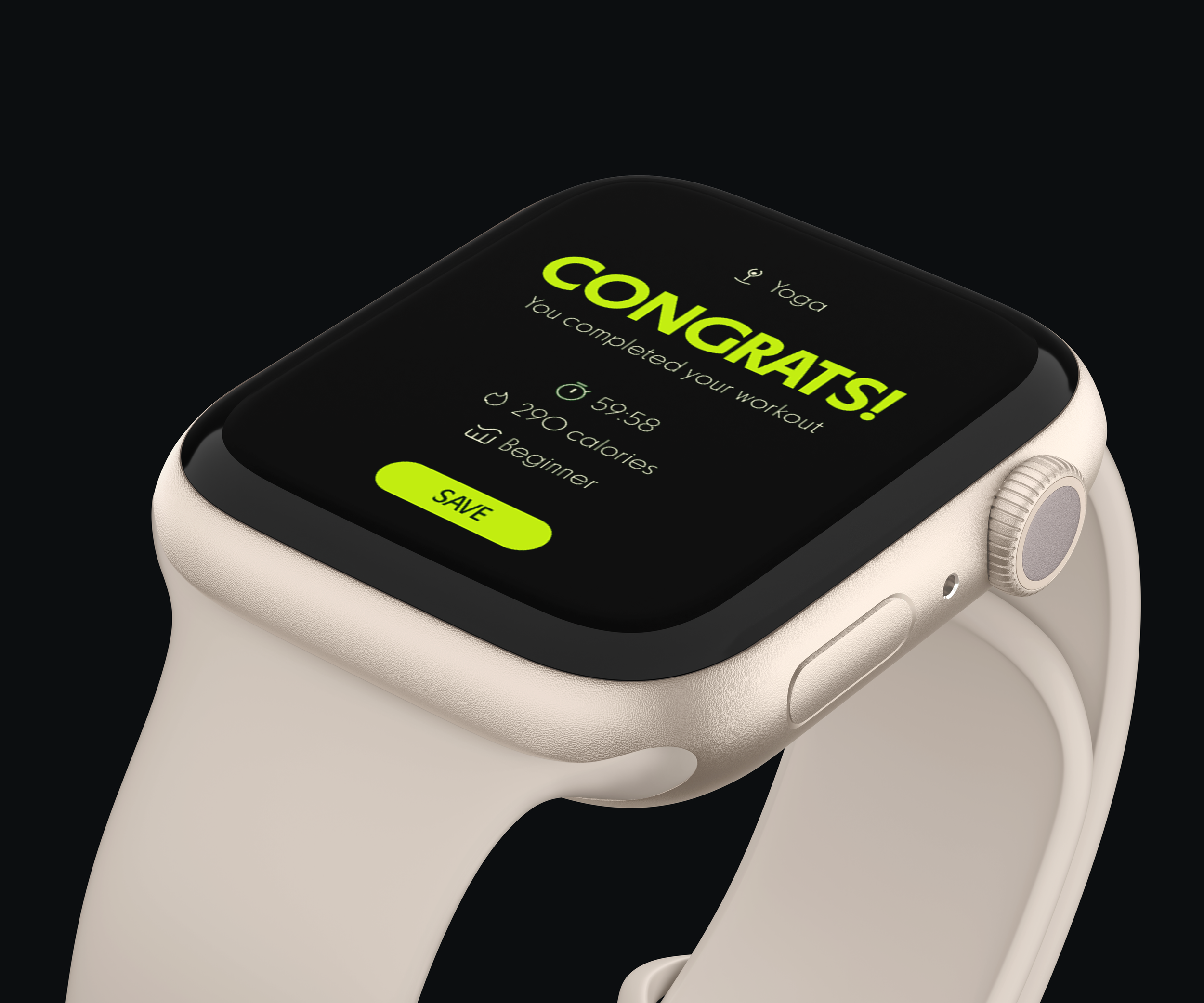
Smartwatch App
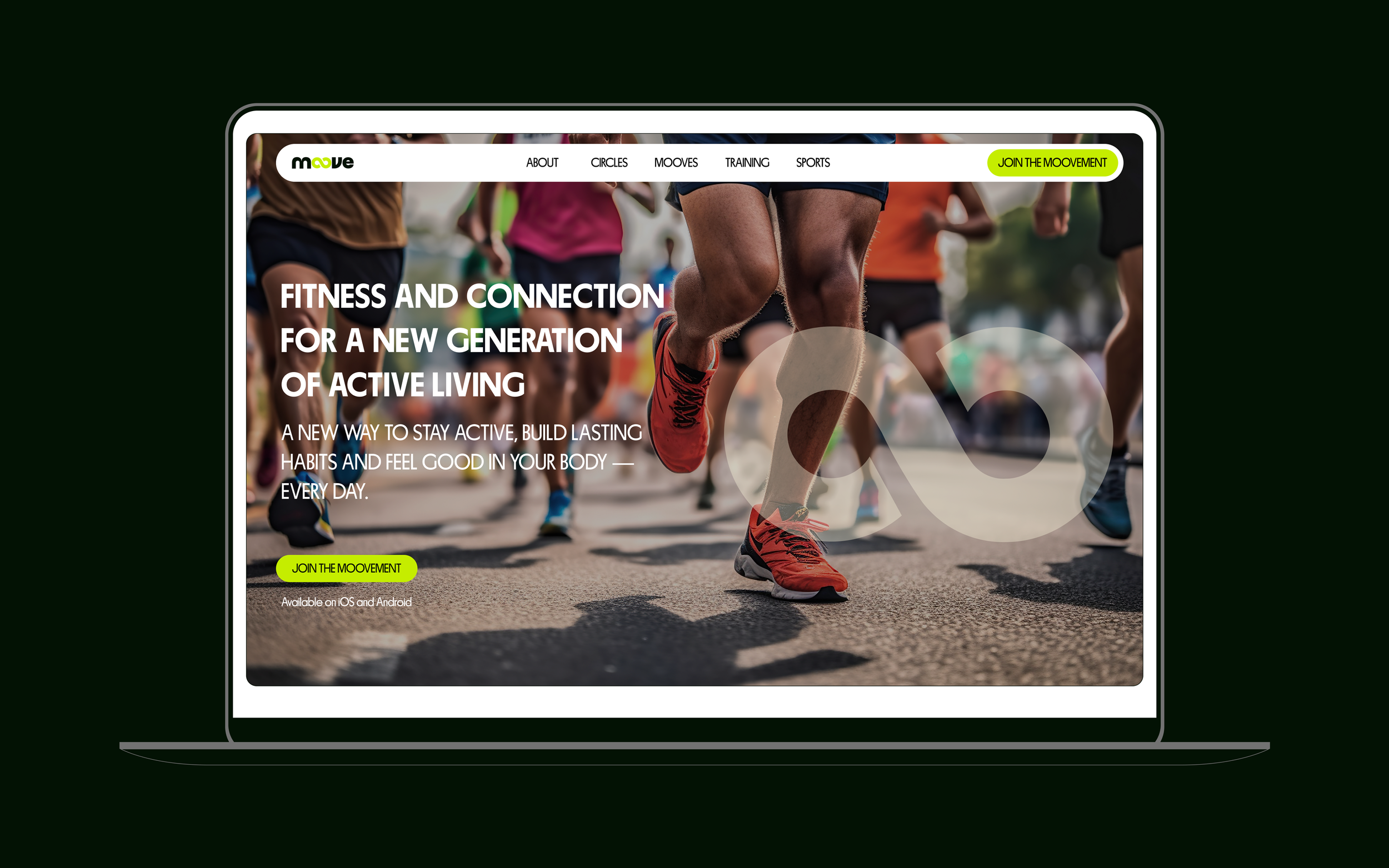
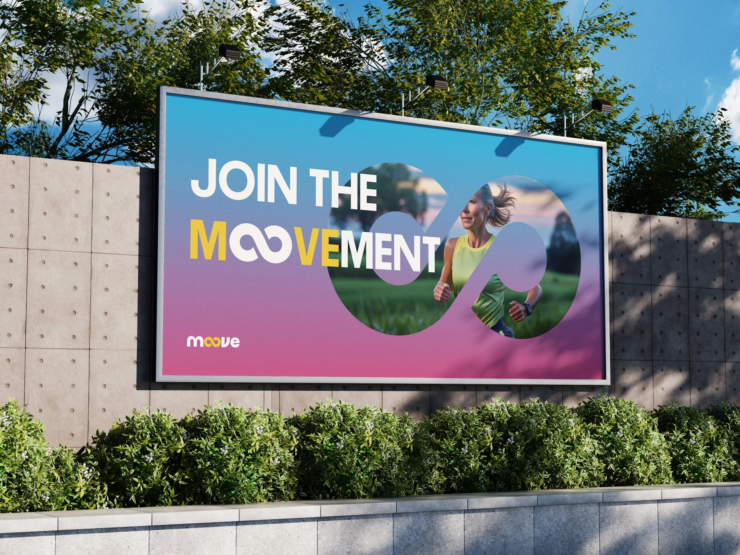
Website (Landing Page)
Social Media
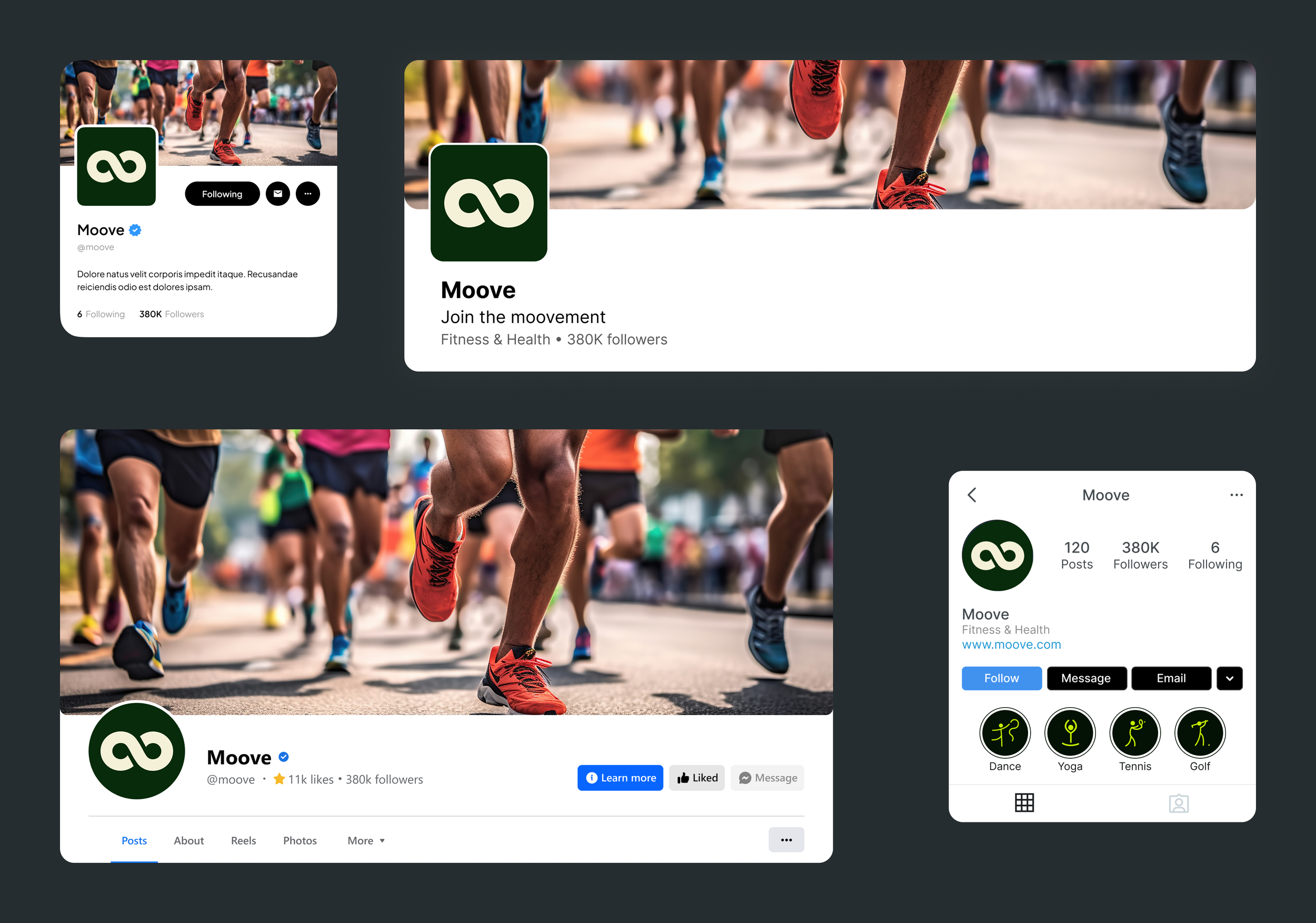
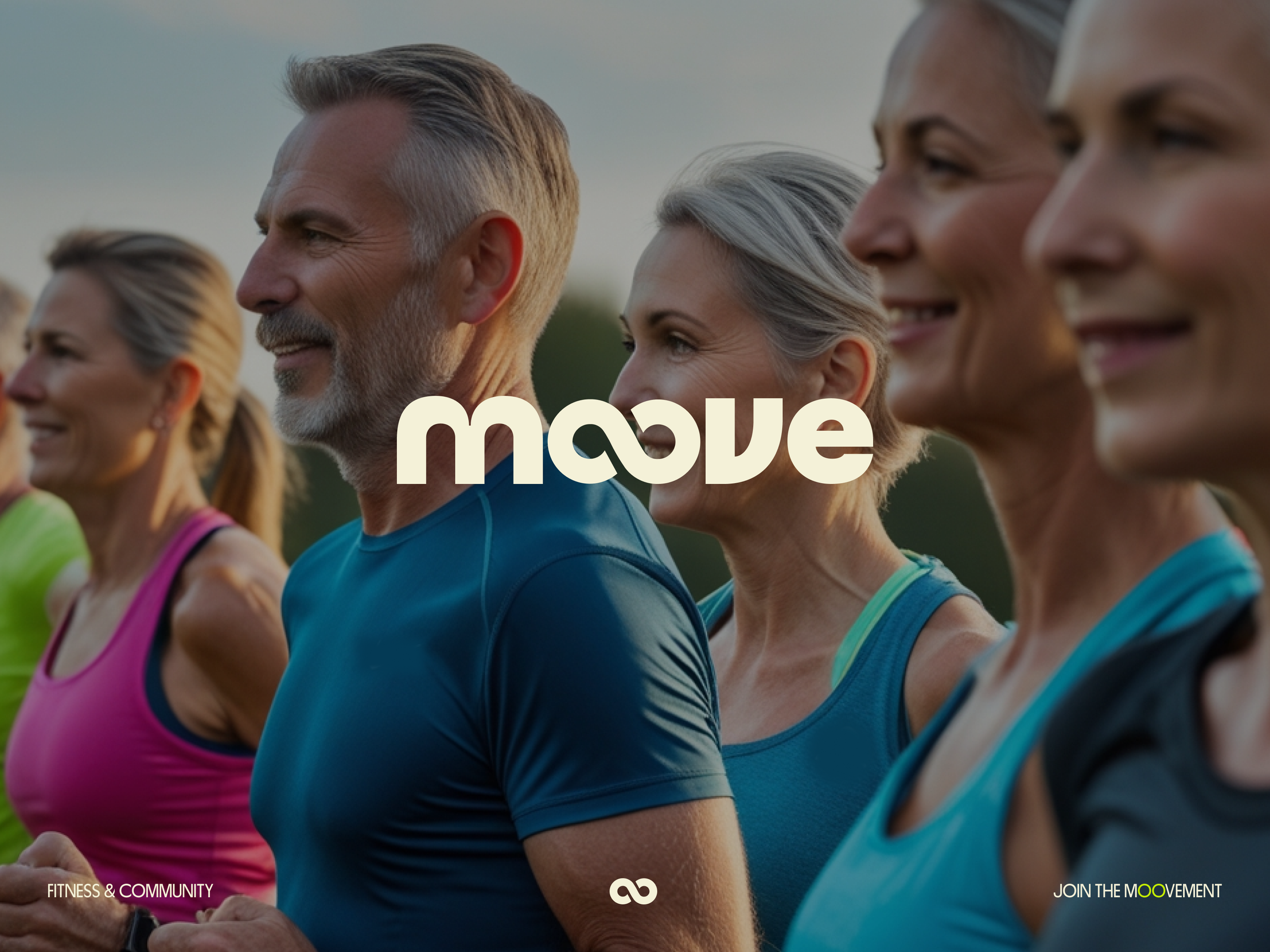
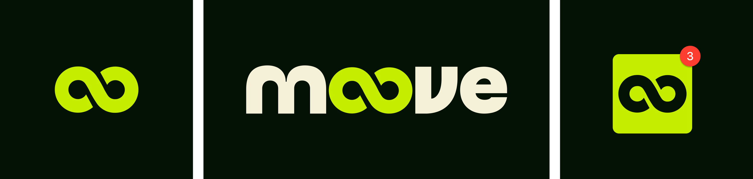
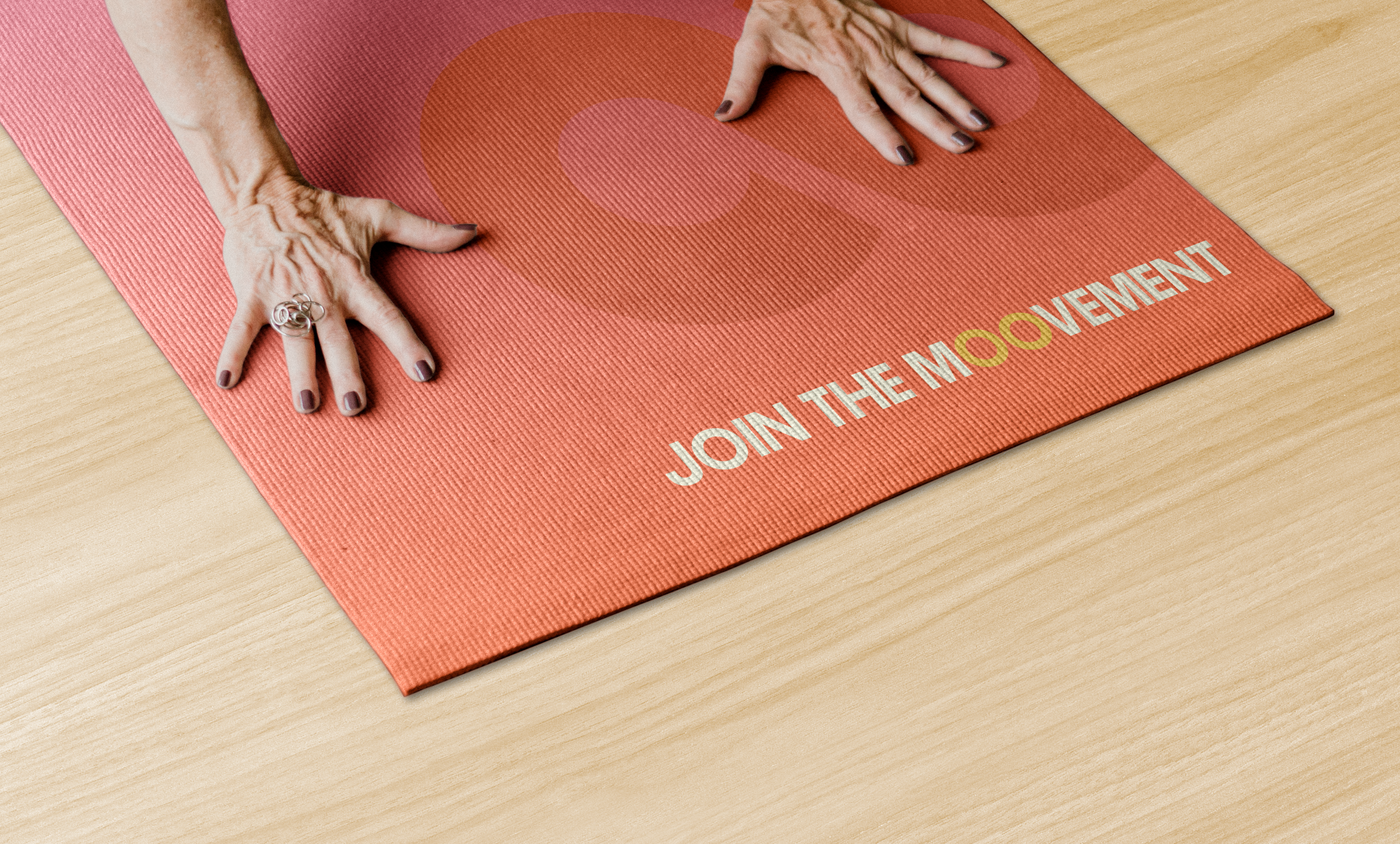
The Logo — A Symbol of Continuity and Movement
Moove’s logo captures the heart of the brand in one simple, fluid gesture. The two “o”s in Moove merge into an infinity symbol, representing continuity, progress and boundless energy. It’s a visual reminder that movement never really ends — it evolves. For some, it means it’s never too late to start; for others, it’s about pushing your limits and seeing how far dedication can take you.
The infinity loop reflects the ongoing rhythm of wellness, the natural flow between motion and rest and the lifelong journey of staying active. It’s not just a mark — it’s a mindset: keep Mooving, keep growing, keep going.
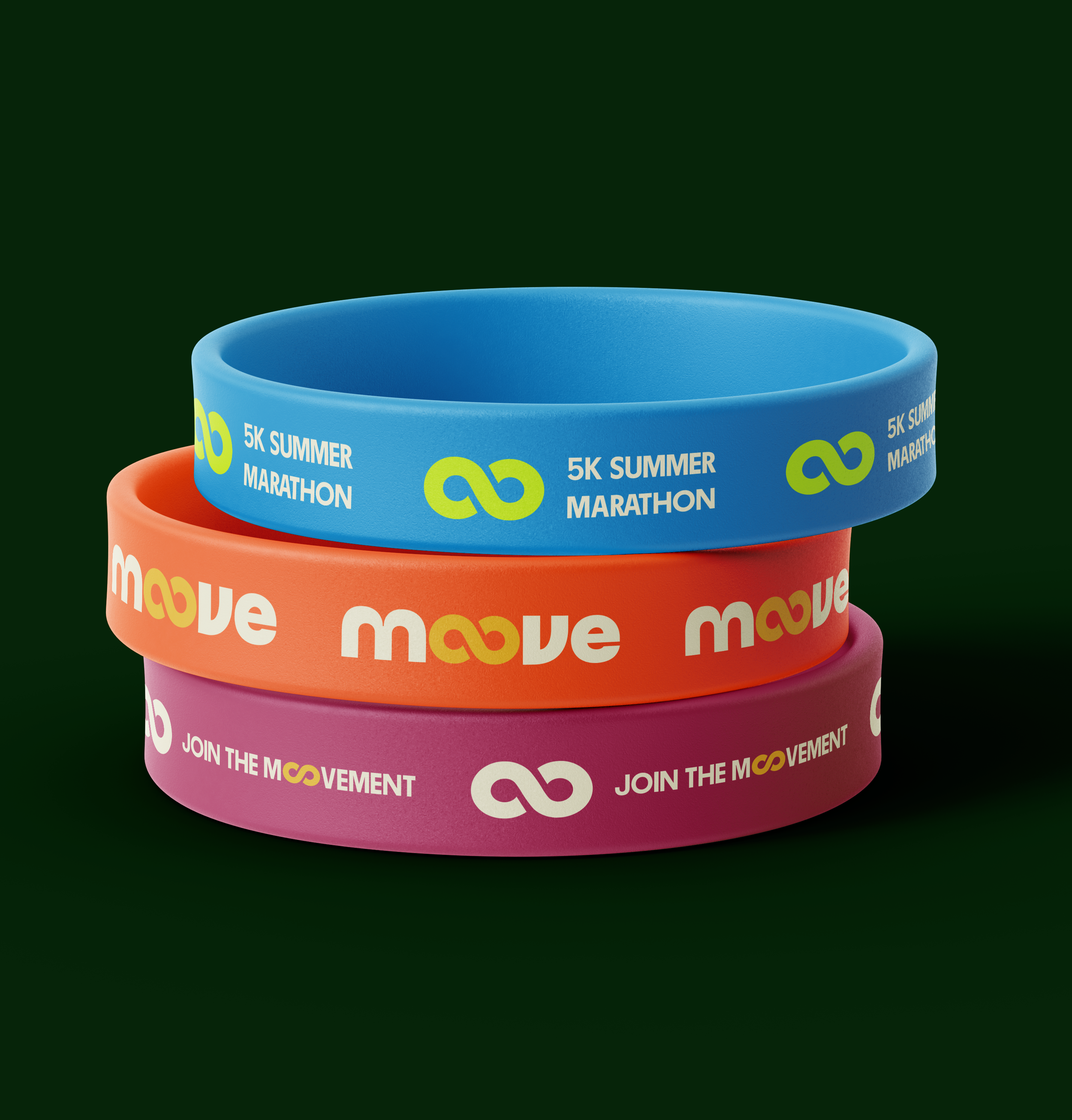
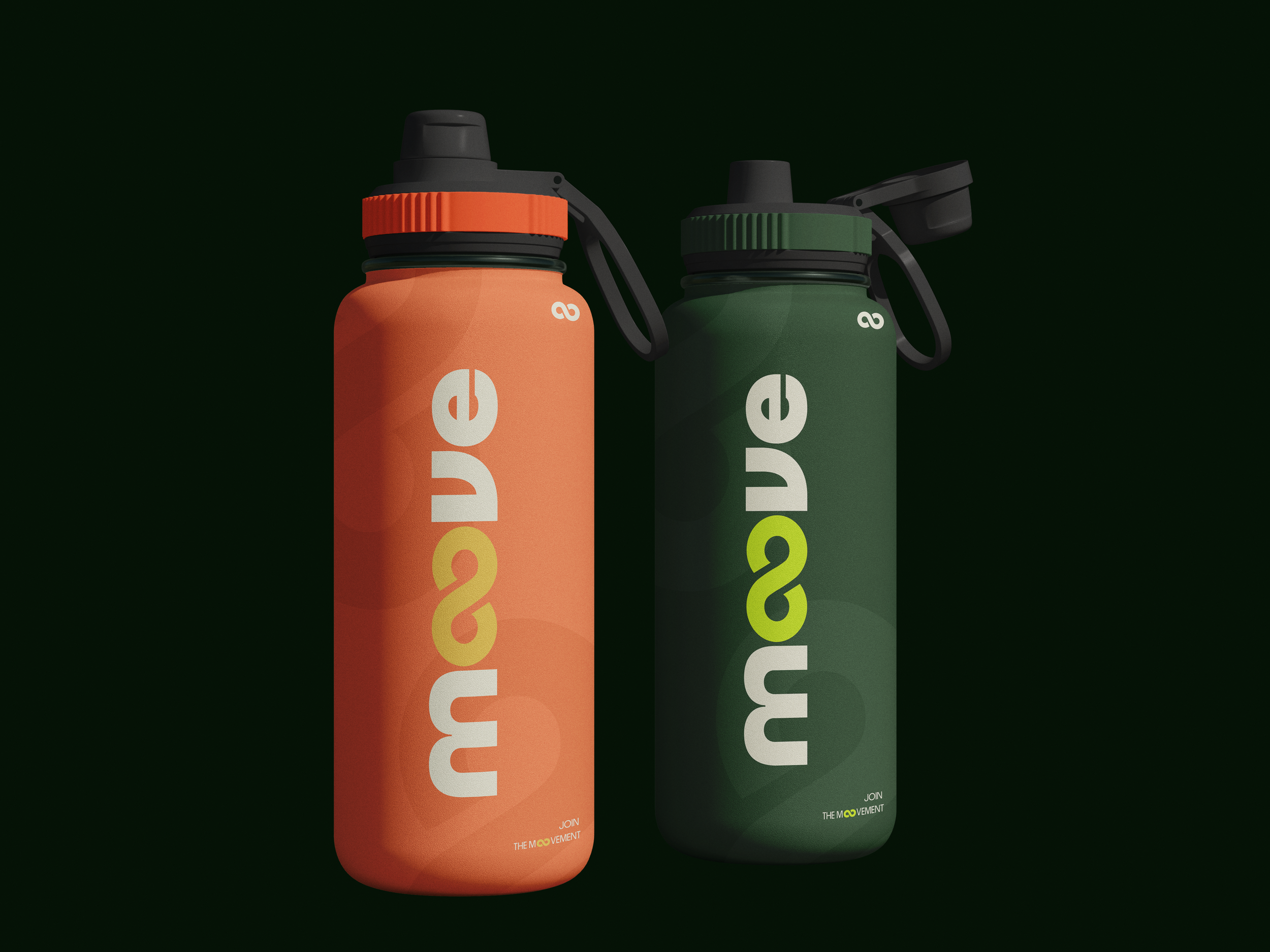
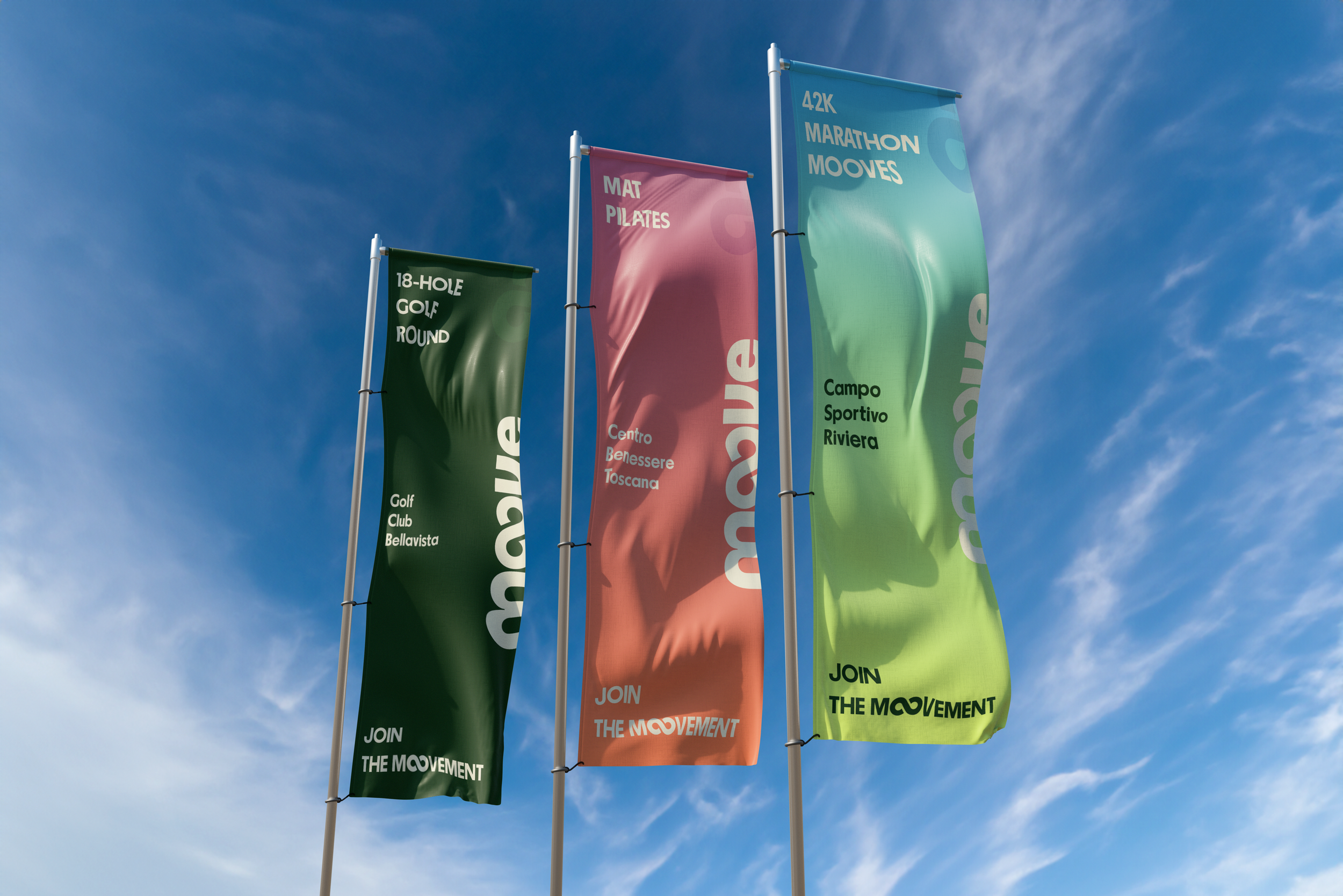
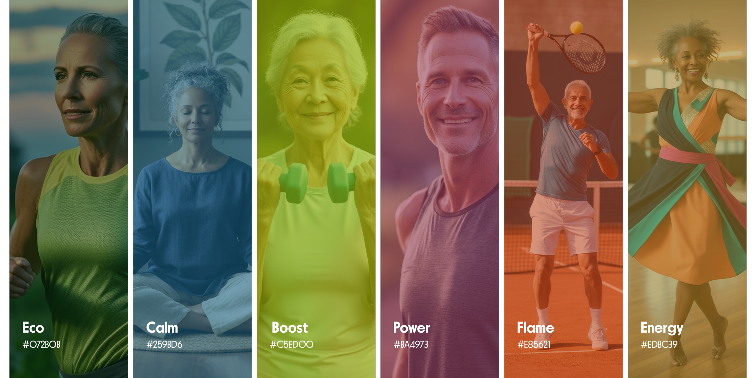
Color Palette — Energy in Motion
Moove’s color palette was designed to capture the vitality, optimism and spark of movement. The brand uses bold, vivid tones that reflect both physical energy and emotional warmth — the kind of feeling you get after a good stretch, a long walk, or a shared laugh with friends.
Vibrant shades of electric coral, deep turquoise, and sunny amber create a visual rhythm that feels alive and uplifting, while soft neutrals and off-whites balance the palette, keeping the interface clean and accessible for the 50+ audience.
Every color choice was intentional: warm hues stimulate motivation and positivity, while cool tones bring calm and balance — just like a good workout. Together, they express Moove’s philosophy of active living with joy and clarity, making every screen feel energetic, inviting and full of life.

Designing with Empathy
— Visual Interface & Accessibility
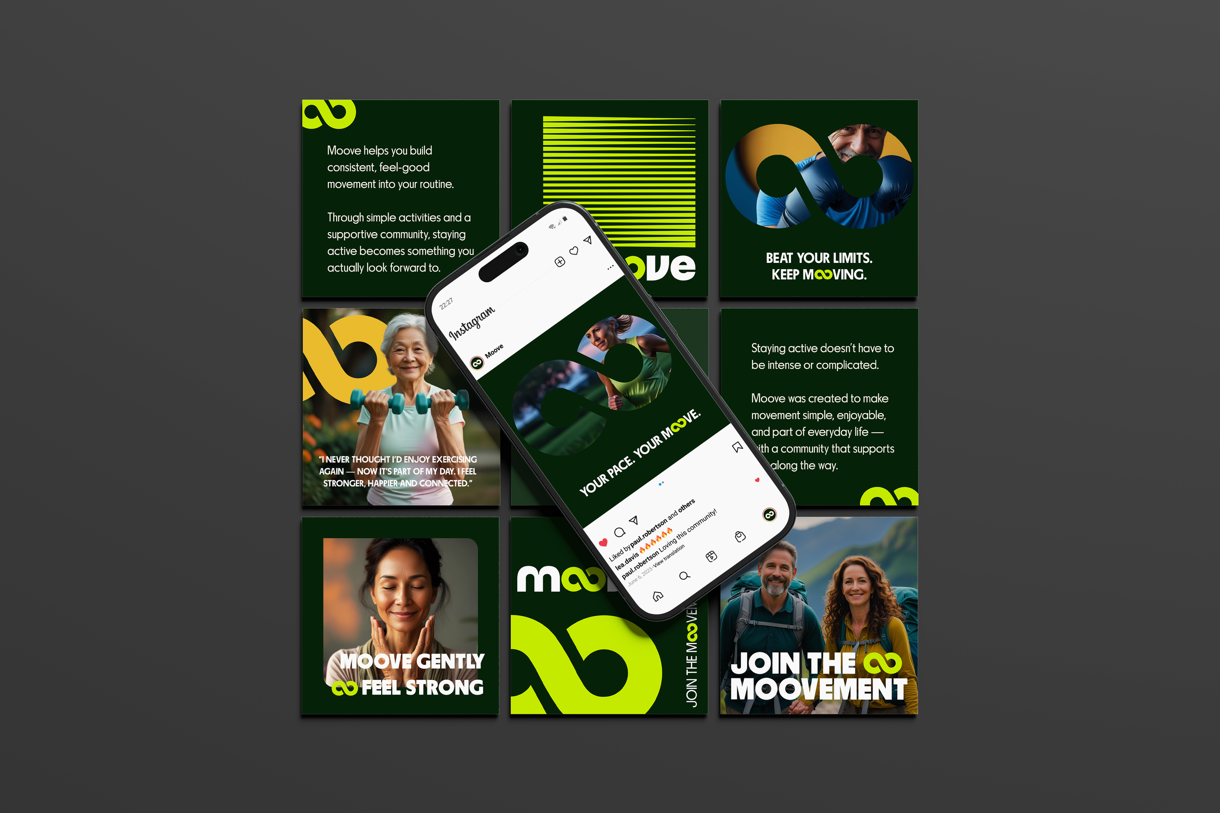
When designing Moove’s interface — both for the app and the website — one of my main priorities was respecting and understanding our audience. I wasn’t designing for digital natives; I was designing for adults 50 and up — a group that values clarity, simplicity and trust over flashy visuals or complex interactions.
Instead of trying to impress with overly dynamic interfaces, I focused on making the experience feel effortless.
Every screen, button and piece of text was designed to say: “You belong here. This is easy. Let’s do this together.”
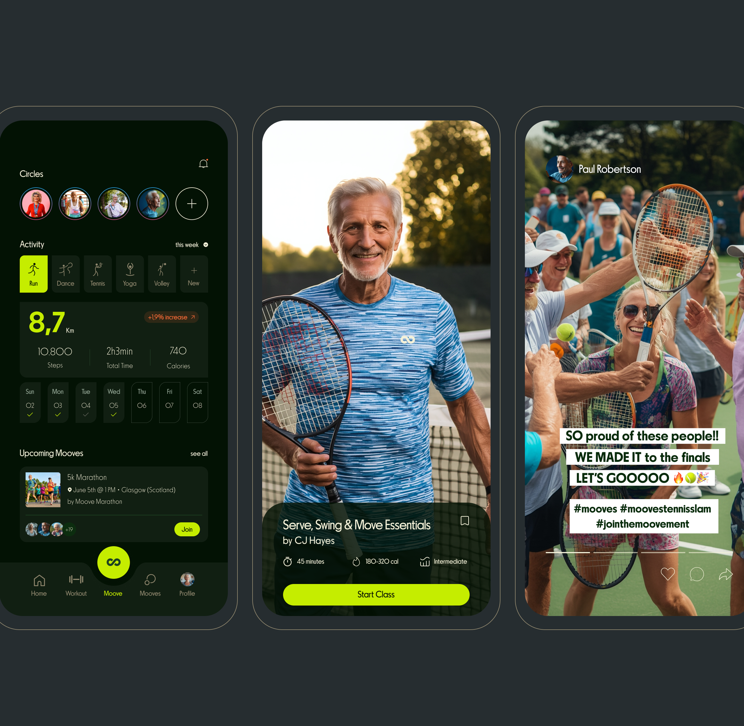
The overall layout is clean, minimalistic and text-first. I prioritized clear language, strong typography and direct labeling over heavy use of icons or complex visual metaphors. Many design elements that are typically represented by graphics — such as charts, badges, and progress indicators — were translated into simple, readable text or plain progress statements.
This approach reduced cognitive load, avoided confusion and allowed users to focus on what really matters: their progress and their community.