


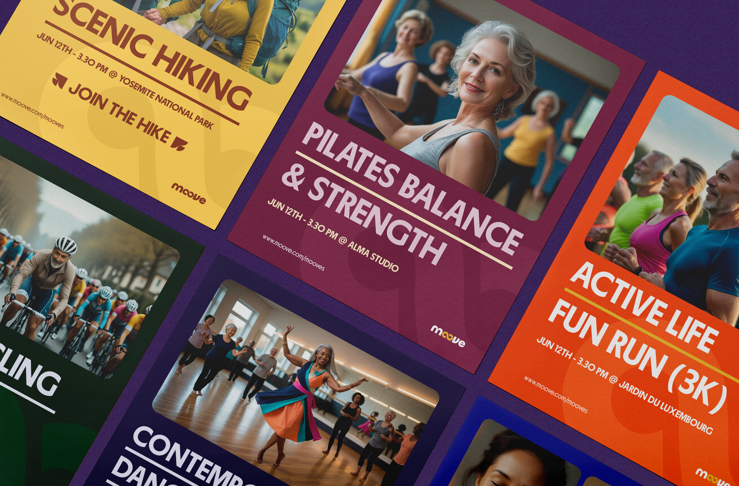
Moove — Fitness and Community for the 50+ Generation
Services
Creative Direction
Brand Strategy
Web Design
UX/UI Design
Social Media Design
Industry
Fitness & Wellness
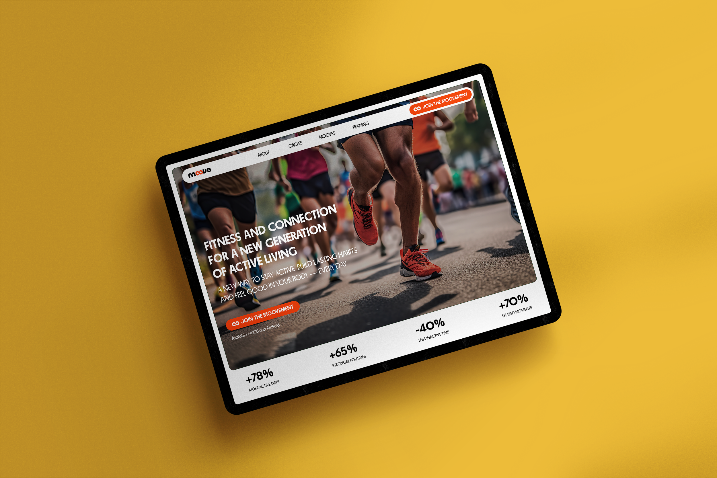
Moove is a fitness and community platform designed for adults aged 50+, created to explore how digital wellness experiences can become more emotionally engaging, accessible and socially driven for an often overlooked audience.
Rather than positioning fitness around performance, intensity or self-optimization, the project reframes movement as a long-term lifestyle built through consistency, social connection and everyday well-being. The goal was to create a brand and digital experience that felt approachable, motivating and deeply human — transforming fitness from an individual obligation into a shared and sustainable experience.
As Creative Director and Brand Strategist, I led the project from initial opportunity exploration through brand development and digital experience design.
Challenge
The fitness and wellness industry is largely built around younger, performance-driven audiences, often relying on high-intensity messaging, complex interfaces and achievement-focused experiences. As a result, many digital wellness platforms unintentionally alienate older users by making fitness feel intimidating, unrealistic or emotionally disconnected.
Research Insights
To better understand the opportunity, I conducted competitive analysis, audience research and behavioral benchmarking across the fitness and wellness landscape. Three recurring patterns emerged:
EXISTING FITNESS BRANDS PRIORITIZE PERFORMANCE
Most competitors focused on transformation, achievement and intensity, often using language and imagery that failed to resonate with older audiences.
ACCESSIBILITY REMAINS AN AFTERTHOUGHT
Many platforms relied on dense interfaces, small typography and complex navigation patterns that introduced unnecessary friction for aging users.
SOCIAL ACCOUNTABILITY DRIVES CONSISTENCY
We combine a thoughtful, human-centered approach with clear communication and reliable results. It’s not just what we do—it’s how we do it that sets us apart.
AI-Enhanced Workflow
AI tools were integrated across research, prototyping and content creation to accelerate execution and expand creative exploration.
ChatGPT was used for competitor analysis and positioning validation
Balsamiq AI and Figma Make supported rapid wireframing and concept testing
Leonardo AI was used to generate institutional imagery and video assets
Key Insight
Most fitness brands motivate through performance, competition and transformation.
Adults 50+ are more often motivated through sustainable habits, emotional rewards and community.

Strategic Direction
Mooove was created to reposition movement as a long-term lifestyle centered around consistency, confidence and social connection rather than performance. The strategic direction focused on reducing cognitive and emotional friction through approachable communication, accessible interaction patterns and a more human-centered brand experience designed to feel supportive, motivating and sustainable.
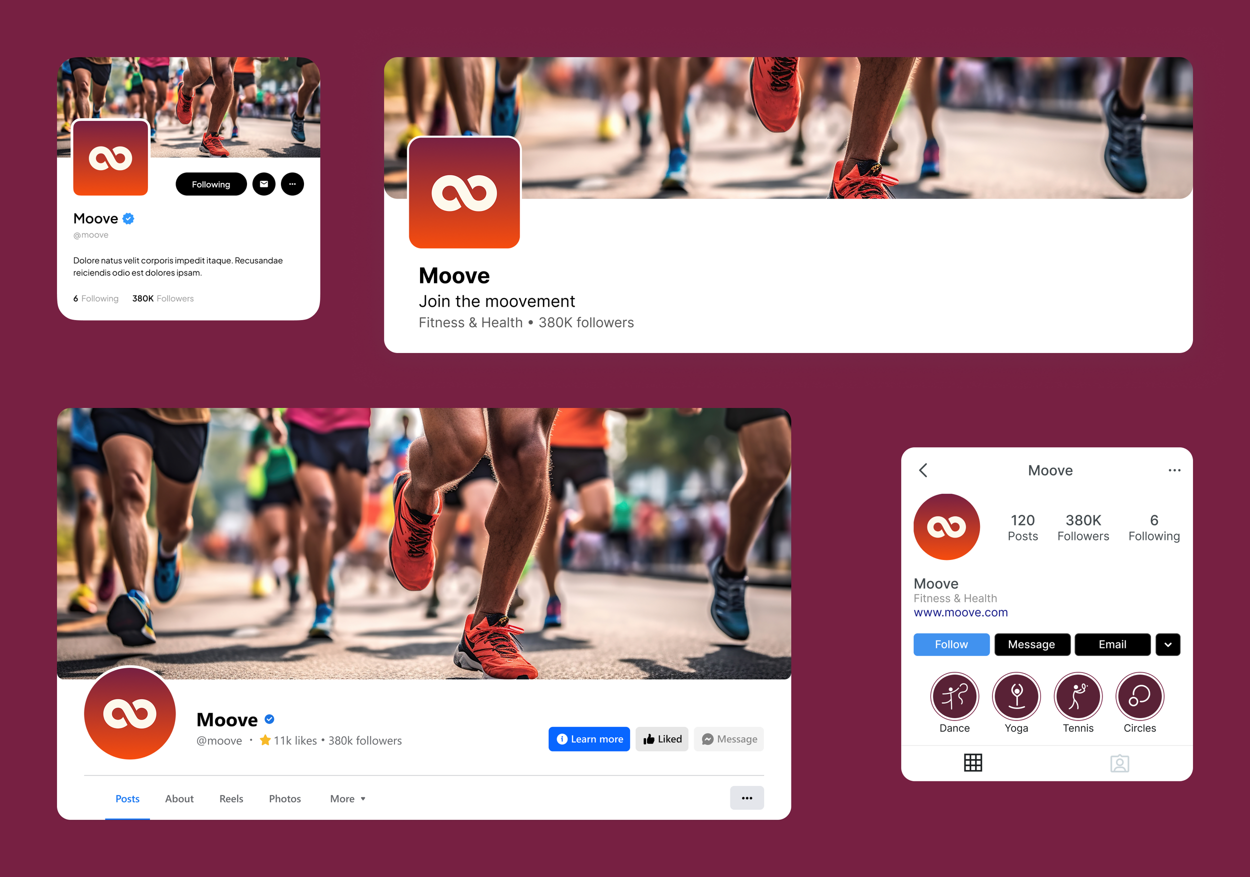
Brand Identity
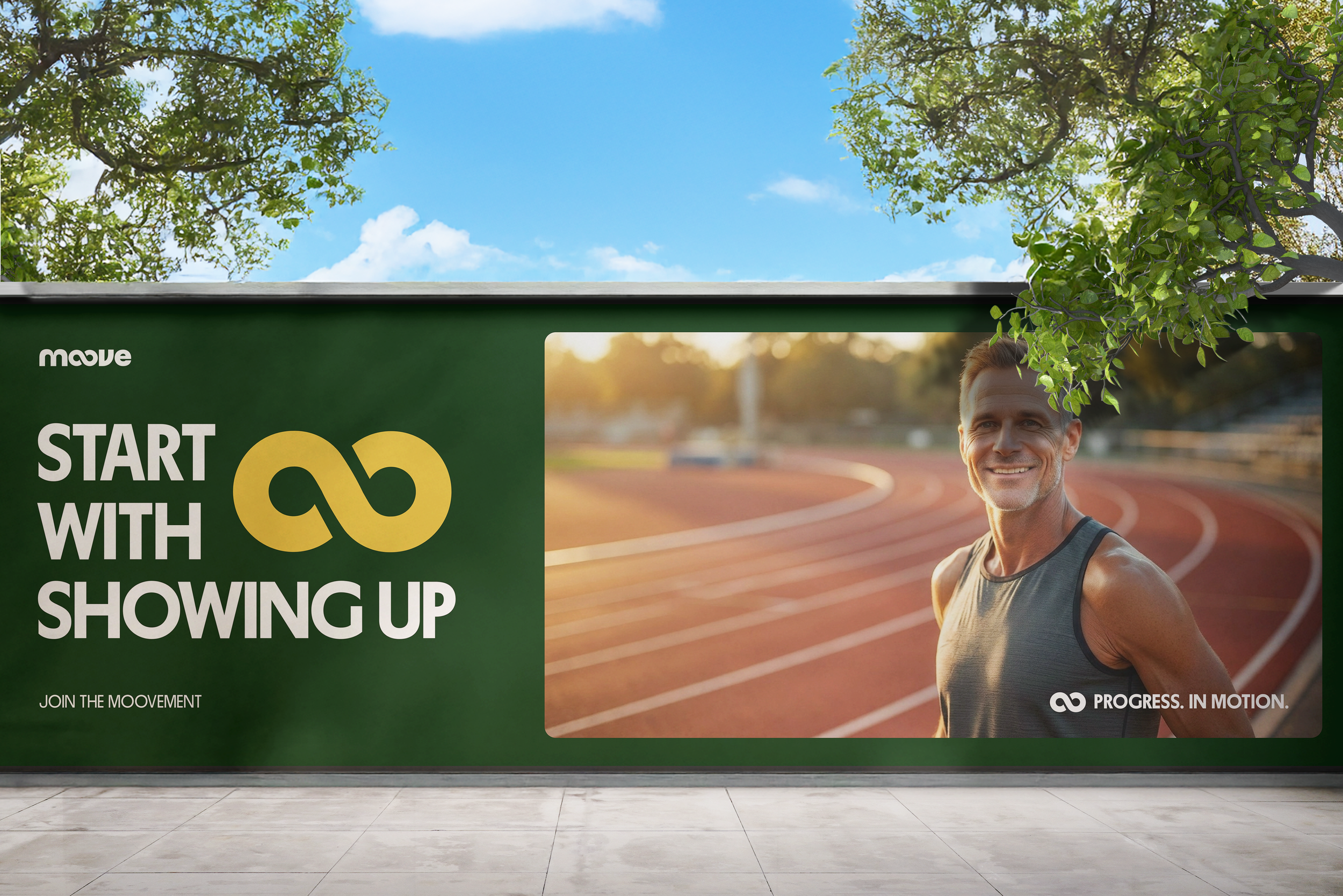
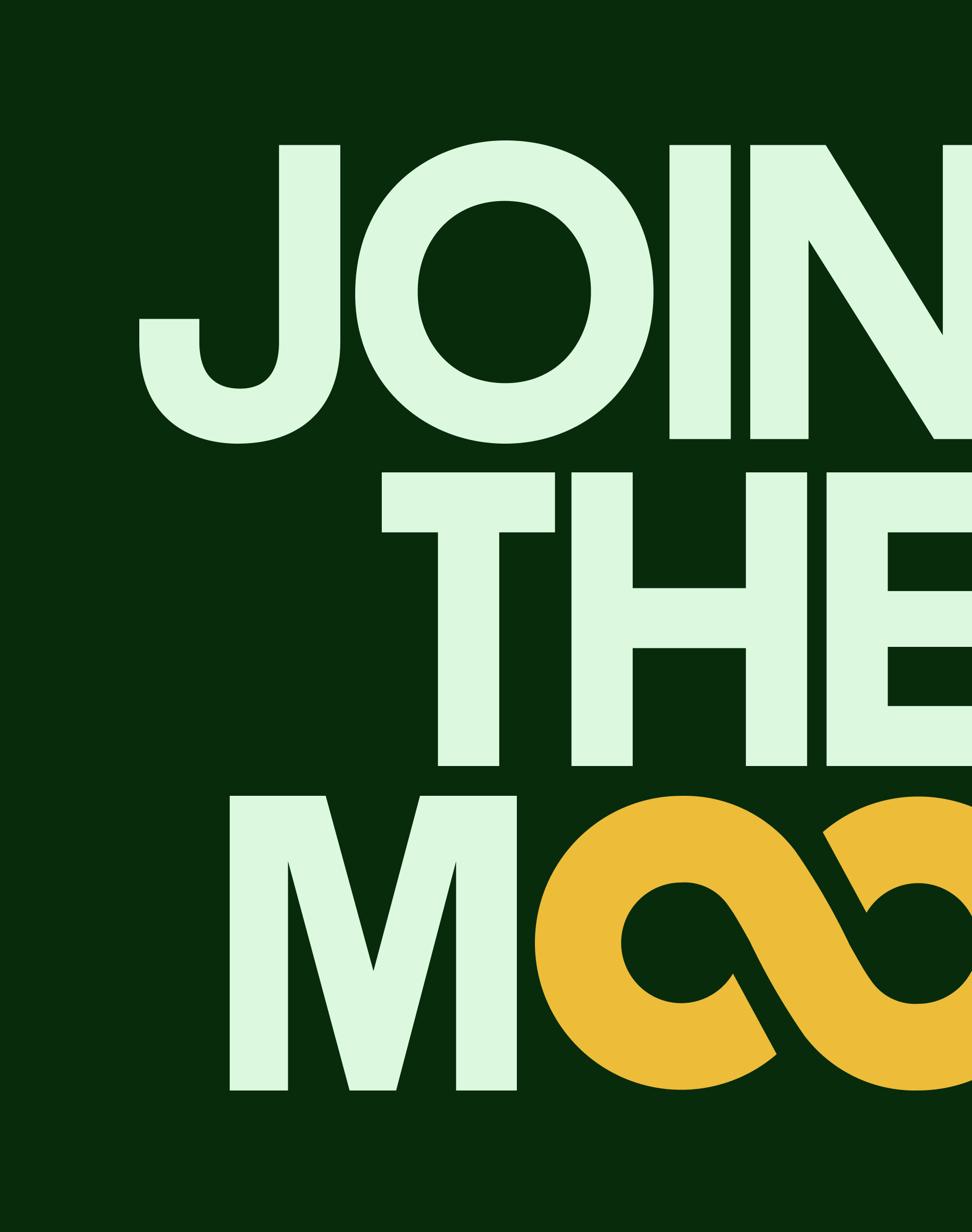
A Symbol of Continuity and Movement
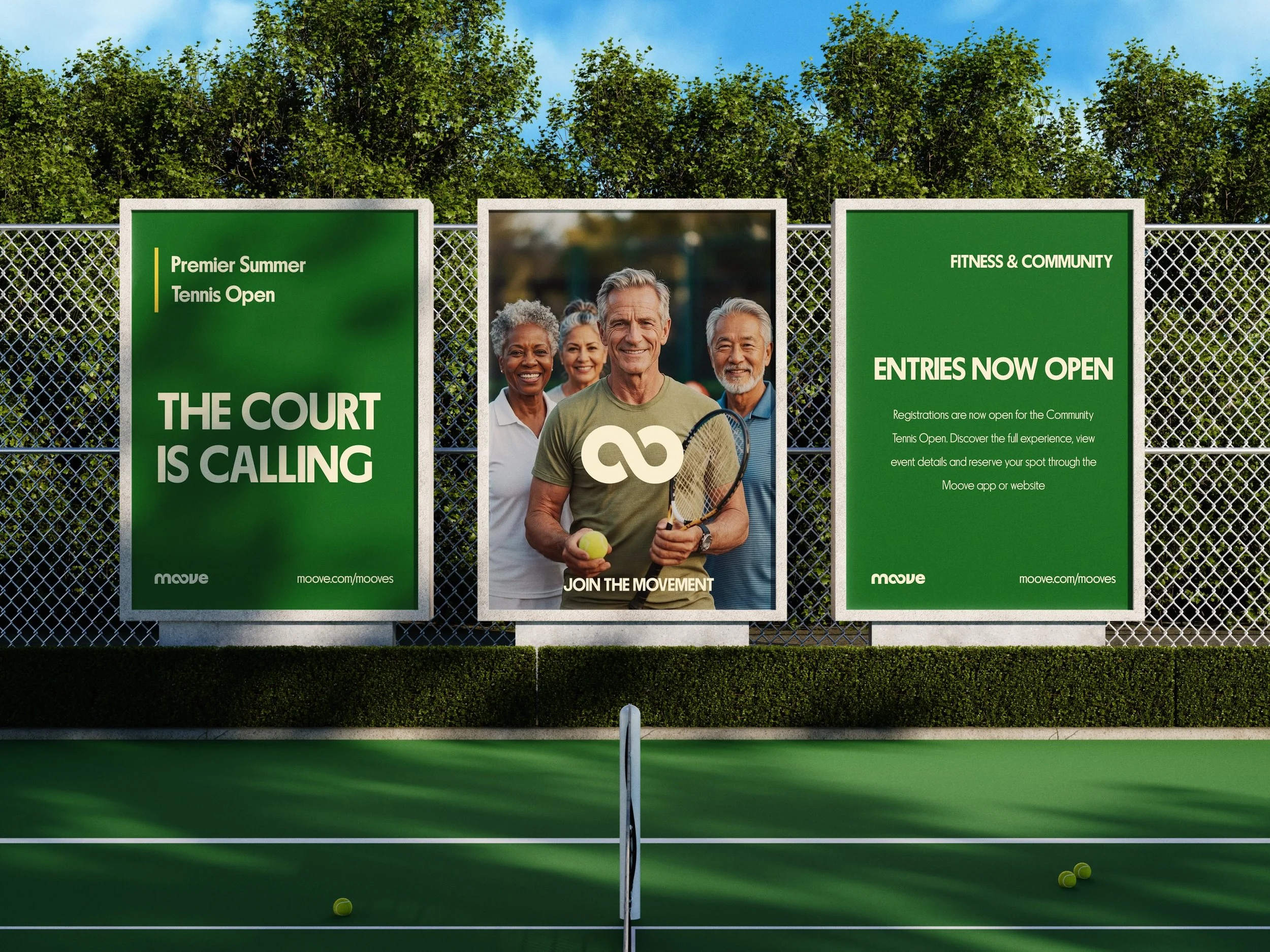
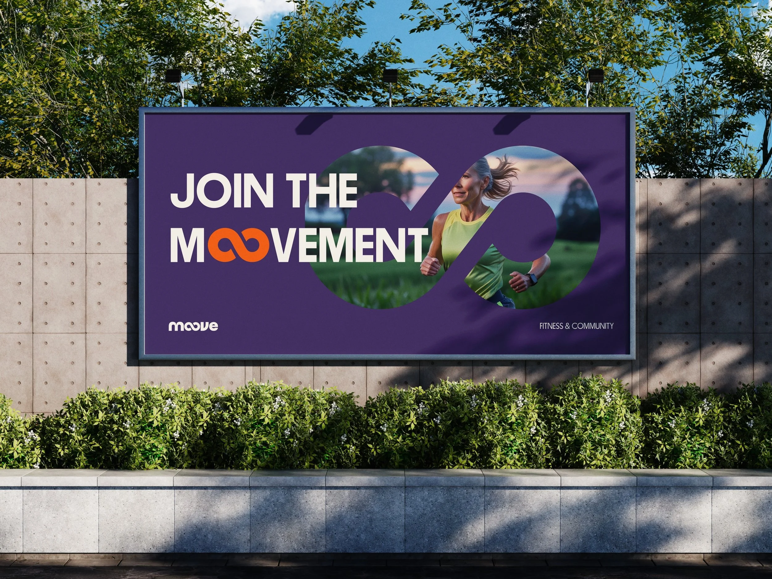
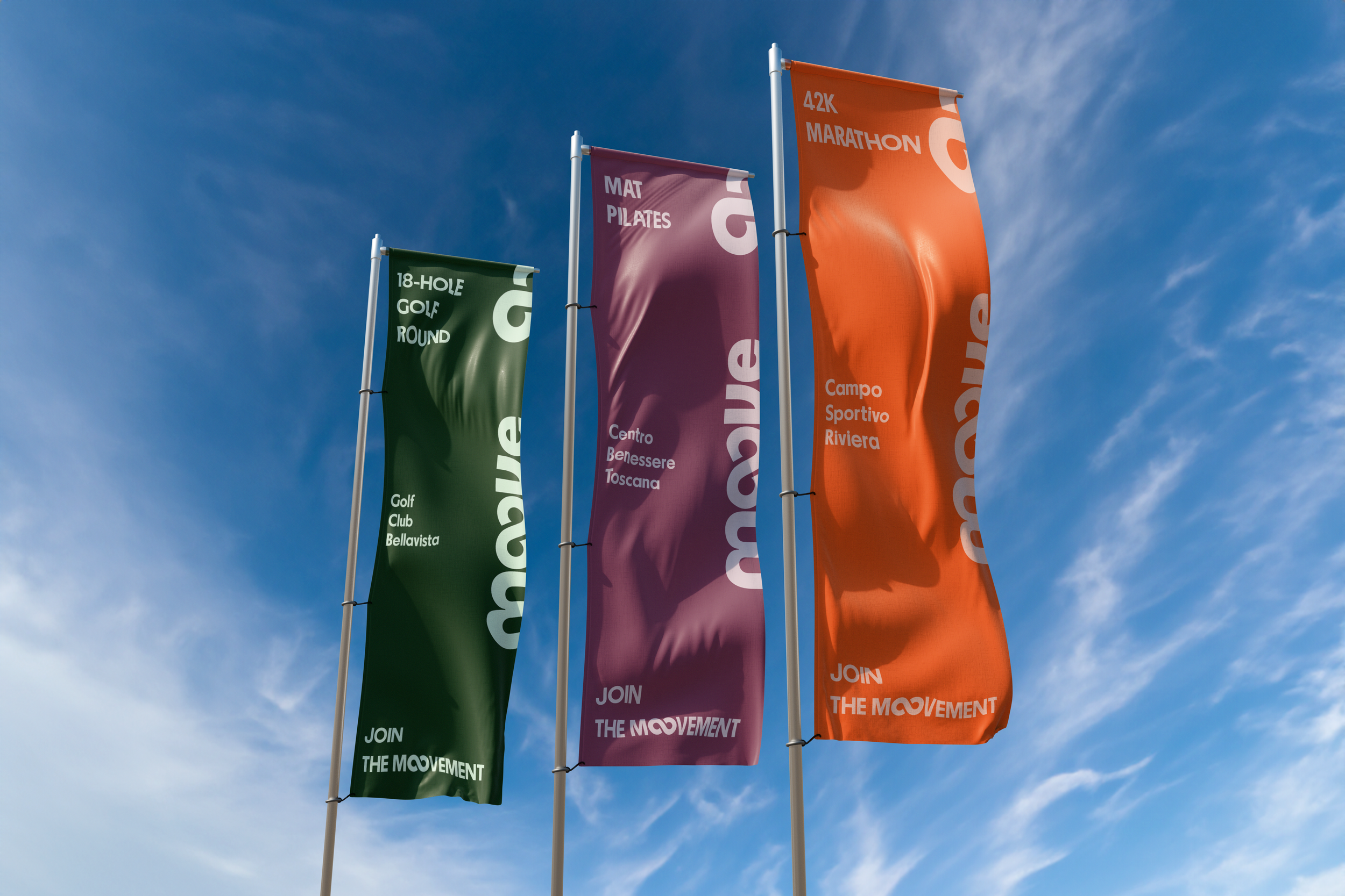
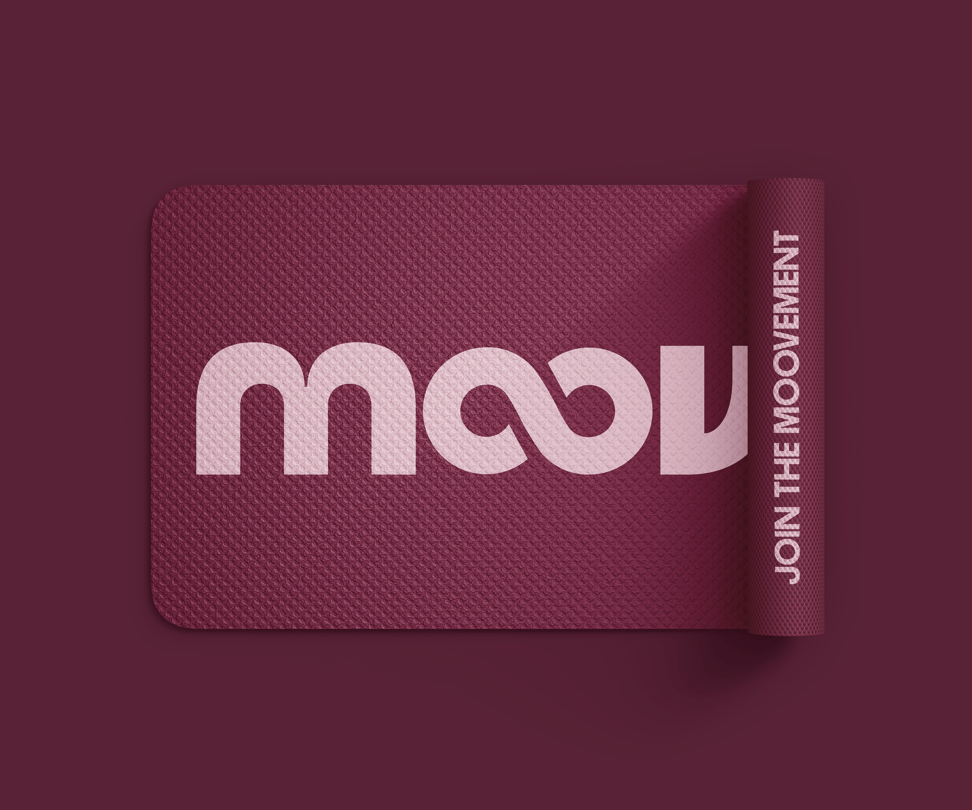
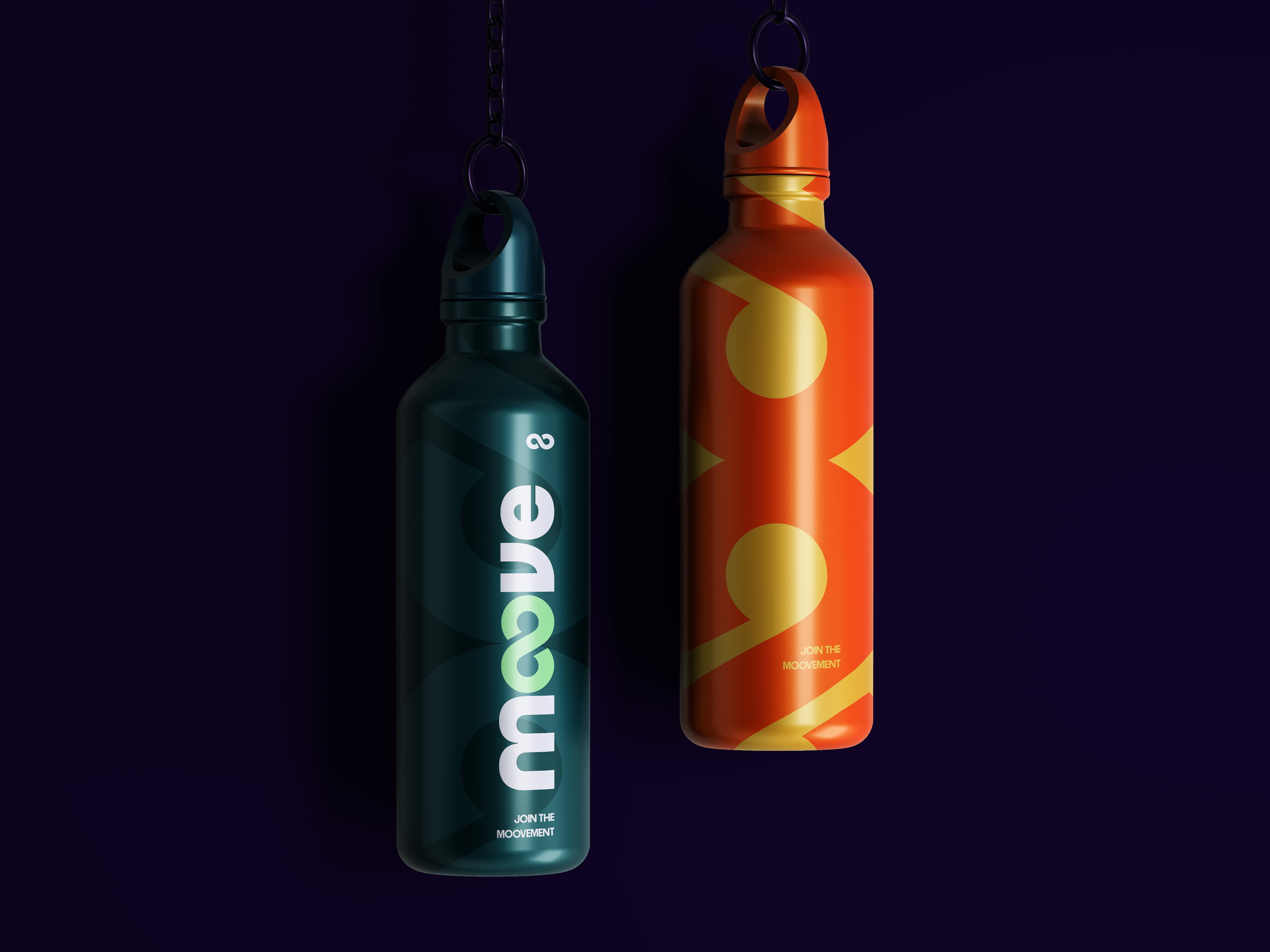
Moove’s logo captures the heart of the brand in one simple, fluid gesture. The two “o”s in Moove merge into an infinity symbol, representing continuity, progress and boundless energy. It’s a visual reminder that movement never really ends — it evolves. For some, it means it’s never too late to start; for others, it’s about pushing your limits and seeing how far dedication can take you.

The infinity loop reflects the ongoing rhythm of wellness, the natural flow between motion and rest and the lifelong journey of staying active. It’s not just a mark — it’s a mindset: keep Mooving, keep growing, keep going.
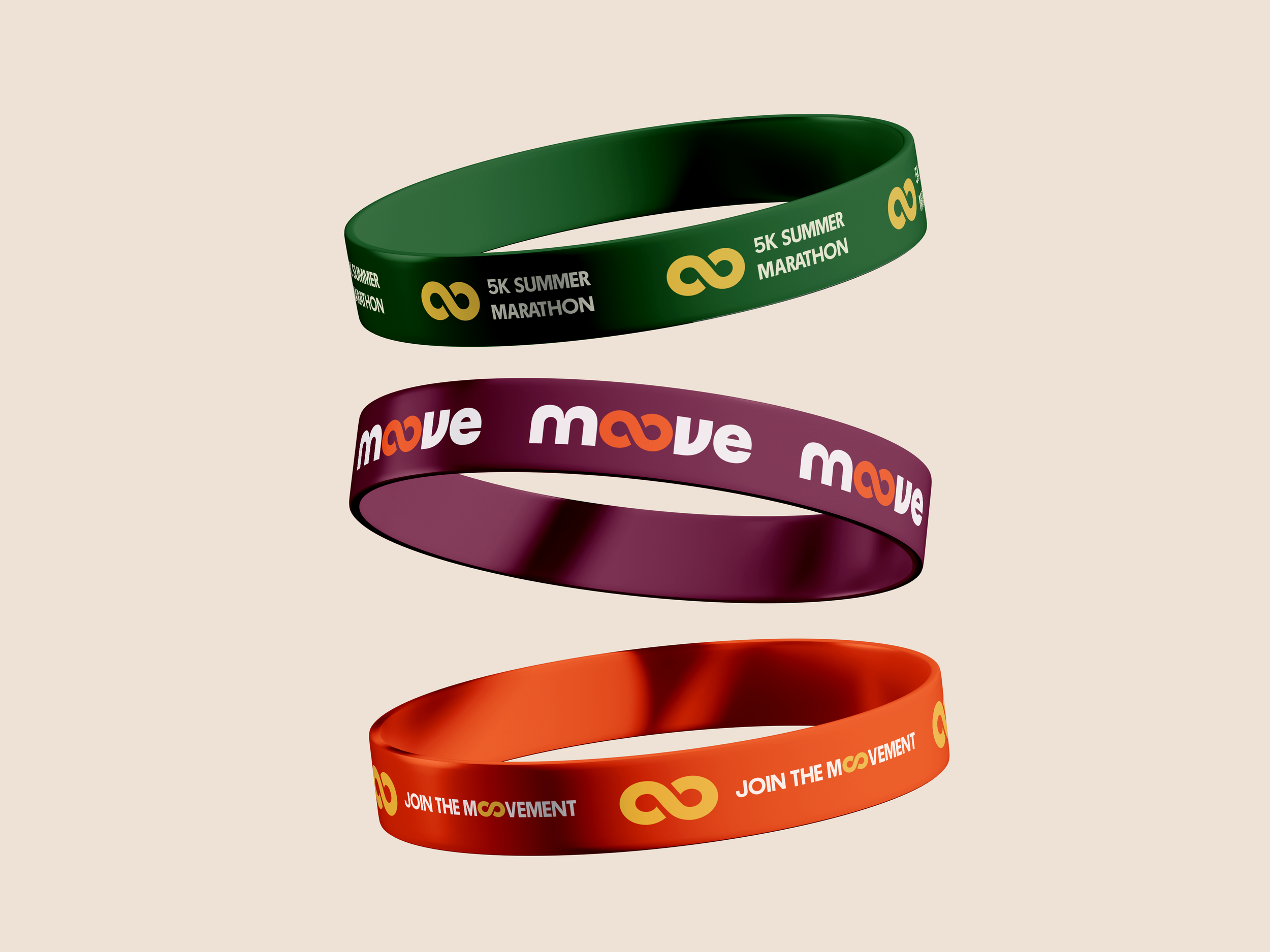
Energy in Motion
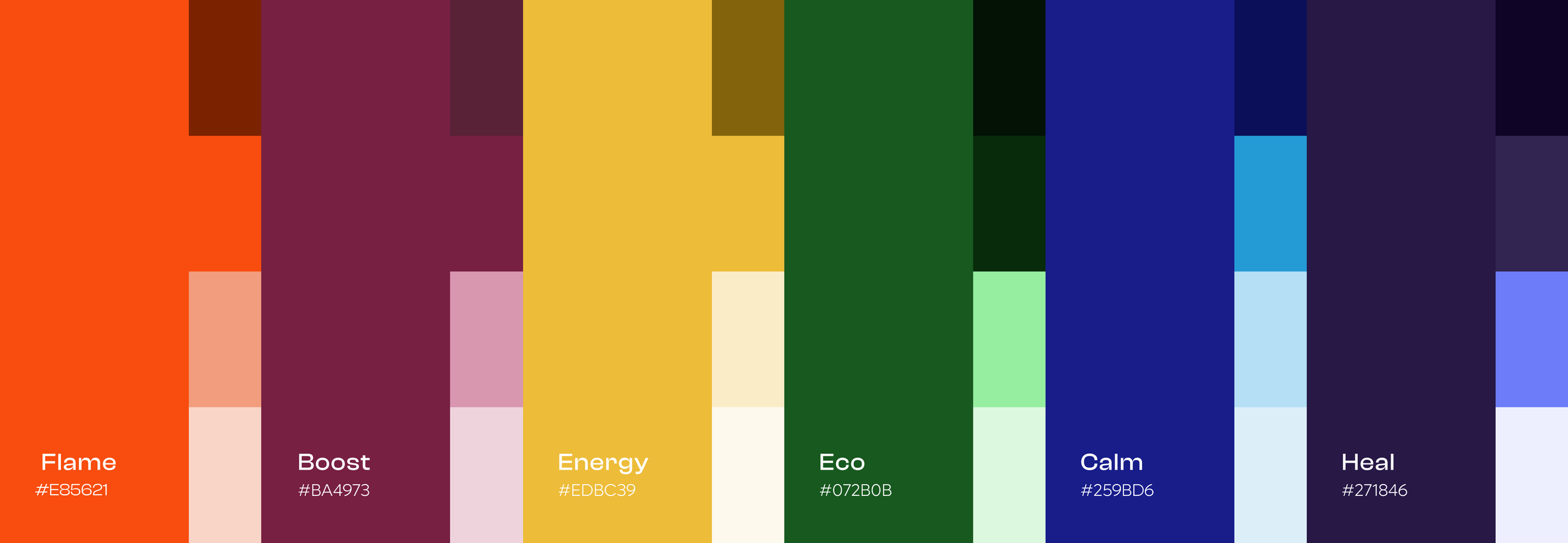
Moove’s color palette was created to reflect the energy, optimism, and emotional warmth of movement. Bold tones like electric coral, deep turquoise, and sunny amber bring a sense of vitality and positivity, inspired by the feeling of staying active and connected with others.
Balanced with soft neutrals and off-whites, the palette keeps the experience clean, accessible, and welcoming for the 50+ audience. Warm hues encourage motivation and joy, while cooler tones introduce calm and balance — together expressing Moove’s vision of active living with clarity, energy, and ease.
Designing with Empathy — Visual Interface and Accessibility
When designing Moove’s visual identity, one of my main priorities was respecting and understanding our audience. I wasn’t designing for digital natives; I was designing for adults aged 50 and up — a group that values clarity, simplicity and trust over flashy visuals or complex interactions. Instead of trying to impress with overly dynamic interfaces, I focused on making the experience feel effortless.

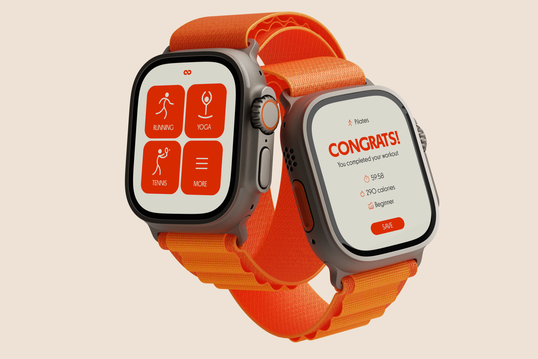
Rather than simplifying the experience, these decisions increased trust and reduced friction, creating a platform that feels supportive rather than overwhelming.
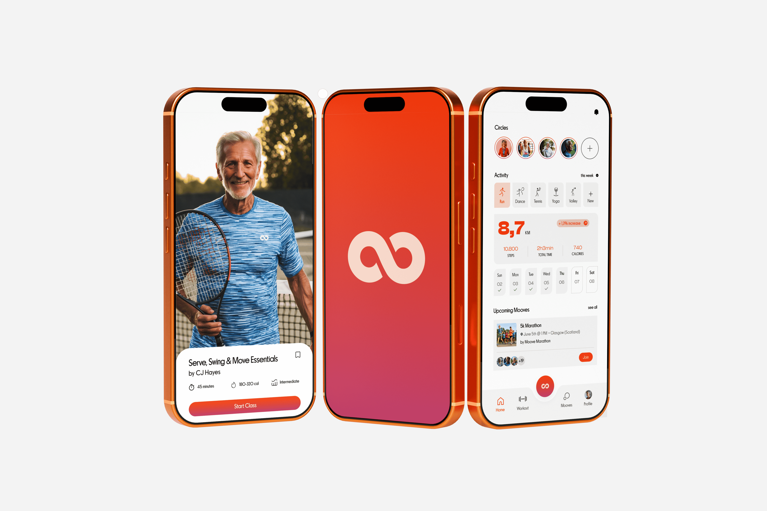

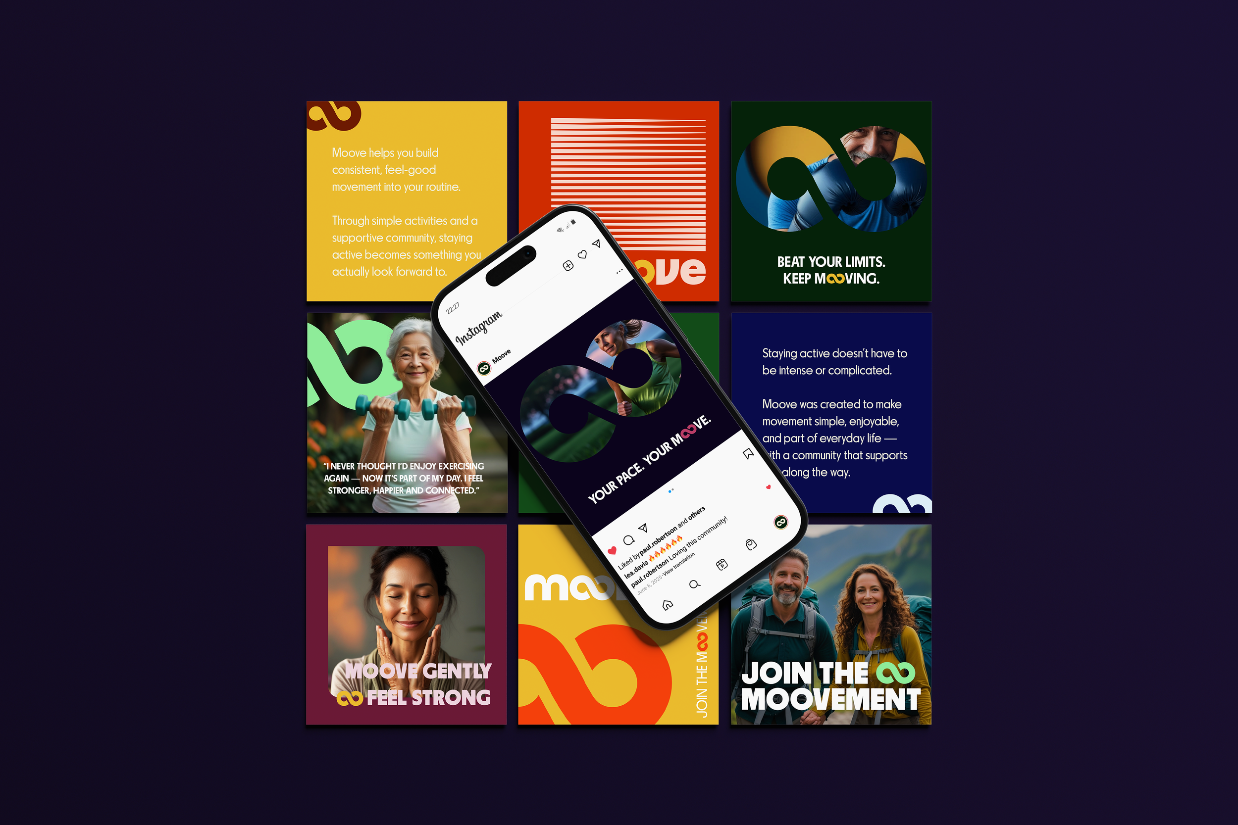
The interaction model focused on encouraging community participation, habit-building, positive reinforcement, approachable onboarding and emotionally supportive communication.


Outcomes
Moove became a strategic exploration of how branding, accessibility principles and digital experience design can intersect to create more inclusive wellness platforms for aging audiences.
Scalable Brand System
I
Developed a flexible visual identity designed to support consistent experiences across digital products, marketing campaigns and future community touchpoints.
Accessibility-First Experience
II
Established a design framework tailored to the needs of adults aged 50+, prioritizing clarity, readability and ease of use to reduce friction and increase confidence.
Habit-Driven Product Strategy
III
Shifted the focus from performance tracking to long-term habit formation, encouraging sustainable engagement through positive reinforcement and achievable progress
Connected Brand Ecosystem
IV
Created a cohesive experience spanning brand identity, product design and community interaction, strengthening the link between movement, motivation and social connection
Designed a scalable system capable of evolving across future features, content initiatives and engagement programs while maintaining consistency and usability.
Foundation for Growth
V
Key Takeaways
Moove became a strategic exploration of how branding, accessibility principles and digital experience design can intersect to create more inclusive wellness platforms for aging audiences.
The project reinforced the importance of designing beyond aesthetics — focusing instead on emotional accessibility, clarity, behavioral understanding, long-term usability and focusing on underserved audiences.
The project became an exploration of how brand strategy, accessibility and digital experience design can work together to create products that are not only functional, but genuinely supportive.
It also highlighted the role of creative leadership in shaping systems—not just visuals—that help people build healthier and more sustainable relationships with wellness.
other projects

Tripee — Structured travel journeys for modern explorers
brand & socials
Finera — Talk With Your Money
brand, web & socials
Omum — Mental Health Through Frequency & Color
brand & socials