AI Marketing Studio - AI-Powered Analytics
PROJECT OVERVIEWHealthcare experiences are often fragmented, stressful and difficult to navigate. Patients juggle multiple platforms, unclear medical data and disconnected communication channels.
This project explores the design of a unified patient portal that centralizes health information, simplifies care management and empowers users through AI-assisted insights and clear data visualization.
❋ IndustryHeathcare / Healthtech
SaaS
B2C
❋ PlatformMobile App
Web App
(Responsive Dashboard)
❋ ServicesProduct Design
SaaS Design
Dashboard Design
Data Visualization
❋ ToolsNotion
Maze
Figma
Stark

PROBLEMPatients technically have access to their health information—but:
Records are scattered across platforms
Appointment systems are inconsistent
Medical data is difficult to interpret
There’s no guidance between visits
The real problem isn’t access—it’s lack of clarity and continuity
SOLUTIONDesign a smart, unified healthcare portal that:
Aggregates medical history, labs, and prescriptions
Provides an AI-powered symptom assistant
Visualizes health data in an intuitive dashboard
Streamlines appointments and care coordination
Prioritizes accessibility and inclusivity
The goal: help patients move from confusion → confidence
Business Goals
Increase patient engagement and retention
Reduce missed appointments
Improve satisfaction with digital healthcare tools
User Goals
Easily access and understand health data
Feel confident making health-related decisions
Save time managing care
Success Metrics
↑ Daily/Monthly active users
↓ Appointment no-show rates
↑ Task completion rate (booking, record access)
↑ User-reported trust & clarity
Designing for Real Lives, Not Just Users

Listening to Patients First
We conducted interviews with 12 participants across different healthcare needs:
Chronic condition patients (6)
Occasional care users (4)
Caregivers (2)
Methods
We combined traditional UX research with AI-supported analysis to uncover patterns faster and more deeply.
User interviews
Competitive analysis
Usability audits
AI-assisted clustering of insights
Key Questions Asked
Understanding Behavior
“How do you currently manage your healthcare information?”
“What tools or apps do you use today?”
Data & Clarity
“How comfortable are you interpreting lab results?”
“What would make medical information easier to understand?”
Pain Points
“What frustrates you most about managing your health?”
“Have you ever missed an appointment or misunderstood results? Why?”
AI Perception
“Would you trust an AI tool to guide you on symptoms?”
“What concerns would you have about that?”
What We Heard (Key Patterns)
“I don’t know what I’m looking at”
1
Most users couldn’t interpret lab results
Heavy reliance on Google (often leading to anxiety)
“Everything is in a different place”
2
Multiple apps, portals and logins
No single source of truth
“I forget or lose track”
3
Missed appointments due to lack of reminders
Medication schedules are hard to maintain
“AI is helpful—but only if I trust it”
4
Openness to AI
Strong need for transparency and validation
Design Decisions that Emerged
Turning patient insights into product strategy
Simplified medical language became a core feature
Medical terminology was a major barrier across all interviews. We introduced plain-language translations alongside clinical terms, helping users quickly understand their results without needing external research. This reduced anxiety and increased confidence in interpreting personal health data.
Dashboard prioritization focused on “what matters now”
Users felt overwhelmed by excessive and poorly structured information. The dashboard was redesigned to surface time-sensitive and high-priority items—such as upcoming appointments, critical alerts, and key health metrics—ensuring users can immediately understand what requires their attention.
AI designed as assistive, not authoritative
While users were open to AI, trust was conditional. We positioned AI as a guide that offers suggestions, explanations, and next steps—never definitive diagnoses. By including confidence indicators and clear disclaimers, we reinforced transparency and user control.
Strong reminder systems integrated across flows
Missed appointments and inconsistent medication adherence were recurring issues. We embedded smart reminders across the experience—appointments, medications, and follow-ups—using timely, contextual notifications to support users in staying on track with their care.
Visual data storytelling replaced raw reports
Raw lab data was difficult for most users to interpret.
We replaced static reports with visualizations such as trend lines, status indicators, and simplified summaries, enabling users to quickly grasp changes in their health and make more informed decisions.


STRATEGYSurface urgent + frequent tasks first
Reduce navigation depth
Use clear, human language
Core sections like Home (Smart Dashboard), Appointments, Medical Records, Symptom Checker (AI), Medications, Messages, and Profile were organized to prioritize speed, clarity and frequency of use. By surfacing urgent and recurring tasks first, minimizing navigation layers, and using clear, human-centered language, the experience enables users to quickly find what they need — especially in moments of stress or uncertainty.
Architecting Simplicity in a Complex System
The information architecture was designed to reflect how patients actually think and act — not how healthcare systems are traditionally structured
CORE STRUCTUREHome (Smart Dashboard) Appointments Medical Records Symptom Checker (AI) Medications Messages Profile
User Flows That Drive Action and Reduce Friction
Key user flows were designed to eliminate friction and guide patients toward clear, confident actions. Whether booking appointments in seconds, understanding lab results at a glance, or receiving guided support through symptom checking, each flow prioritizes simplicity, speed, and clarity. The experience ensures users always know what to do next—reducing uncertainty and enabling more proactive healthcare management.

Understand results at a glance

Book appointments in seconds

Get guidance when symptoms arise
Rapid Prototyping with AI-Assisted Exploration
The design process focused on rapid iteration to continuously improve clarity and usability. Early wireframes were used to validate navigation and information hierarchy, revealing areas of confusion and friction. Through multiple iterations, we reduced cognitive overload by simplifying layouts and refining content structure. AI-assisted tools played a key role in accelerating layout exploration and testing variations, allowing the team to quickly converge on the most intuitive and effective solutions.


UI That Builds Trust Through Simplicity

Clean layouts and strong hierarchy
High readability and contrast

Clean layouts and strong hierarchy
Data visualizations that explain — not overwhelm
DESIGN
Core Structure
Home (Smart Dashboard)
Appointments
Medical Records
Symptom Checker (AI)
Medications
Messages
Profile
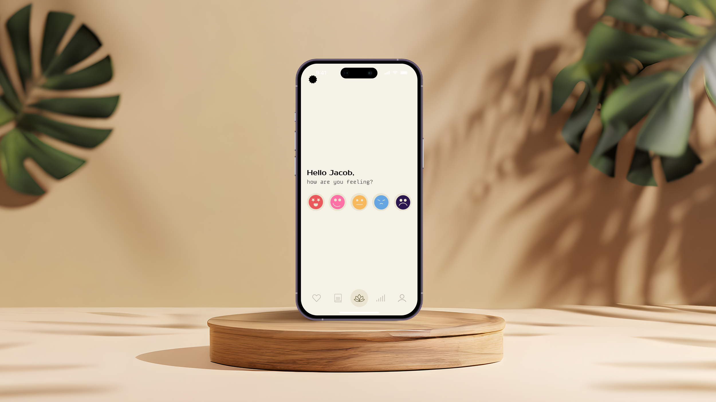
1. Your Health, At a Glance — Smart Dashboard
Upcoming appointments and reminders
Key health metrics with visual trends
Alerts that require attention
👉 Designed to answer: “What do I need to know right now?”
2. Medical Records, Translated — Not Just Stored
Lab results with simplified explanations
Visual indicators (normal vs. attention)
Historical tracking for better context
👉 Turning complex data into clear, digestible insights
3. AI That Guides, Not Diagnoses — Symptom Checker
Conversational, step-by-step interaction
AI-generated suggestions with confidence levels
Clear next steps (self-care, doctor visit, urgent care)
👉 Built to reduce anxiety and support decision-making—not replace doctors
4. Effortless Care Coordination — Appointment Management
Seamless booking and rescheduling
Calendar sync and smart reminders
Reduced friction across providers
Measured Impact on Engagement and Care
The redesigned experience translated directly into measurable improvements across key patient behaviors and perceptions. By simplifying access to information, guiding users through critical actions, and introducing trustworthy AI support, the platform increased engagement, reduced missed appointments, improved task completion rates, and strengthened user trust. These outcomes demonstrate how thoughtful, human-centered design can drive both better digital experiences and more effective healthcare management.
+30%
Increase in User Trust
Trust in digital healthcare increased with transparency and guidance
+30%
Increase in User Trust
Trust in digital healthcare increased with transparency and guidance
+30%
Increase in User Trust
Trust in digital healthcare increased with transparency and guidance
Key Learnings
CLARITY OVER COMPLETENESSToo much information can overwhelm users. Prioritizing clear, simplified content helped patients understand and act with confidence
ACCESSIBILITY FOR ALLDesigning for accessibility made the product easier to use for everyone. Simpler layouts and better readability reduced friction across the board
DESIGN FOR TRUSTTrust is built through transparency and consistency. Clear messaging, especially around AI, reinforced credibility and user confidence
BALANCE EMOTION AND DATAHealthcare experiences are both emotional and informational. The design needed to support users with clear data while reducing anxiety and uncertainty