


Tripee — Structured travel journeys for modern explorers
Services
Branding, Web
Tools
Industry
Travel Tech
Hospitality and Transportation
Adobe Illustrator
Adobe Photoshop
Figma
Affinity
Leonardo AI
ChatGPT
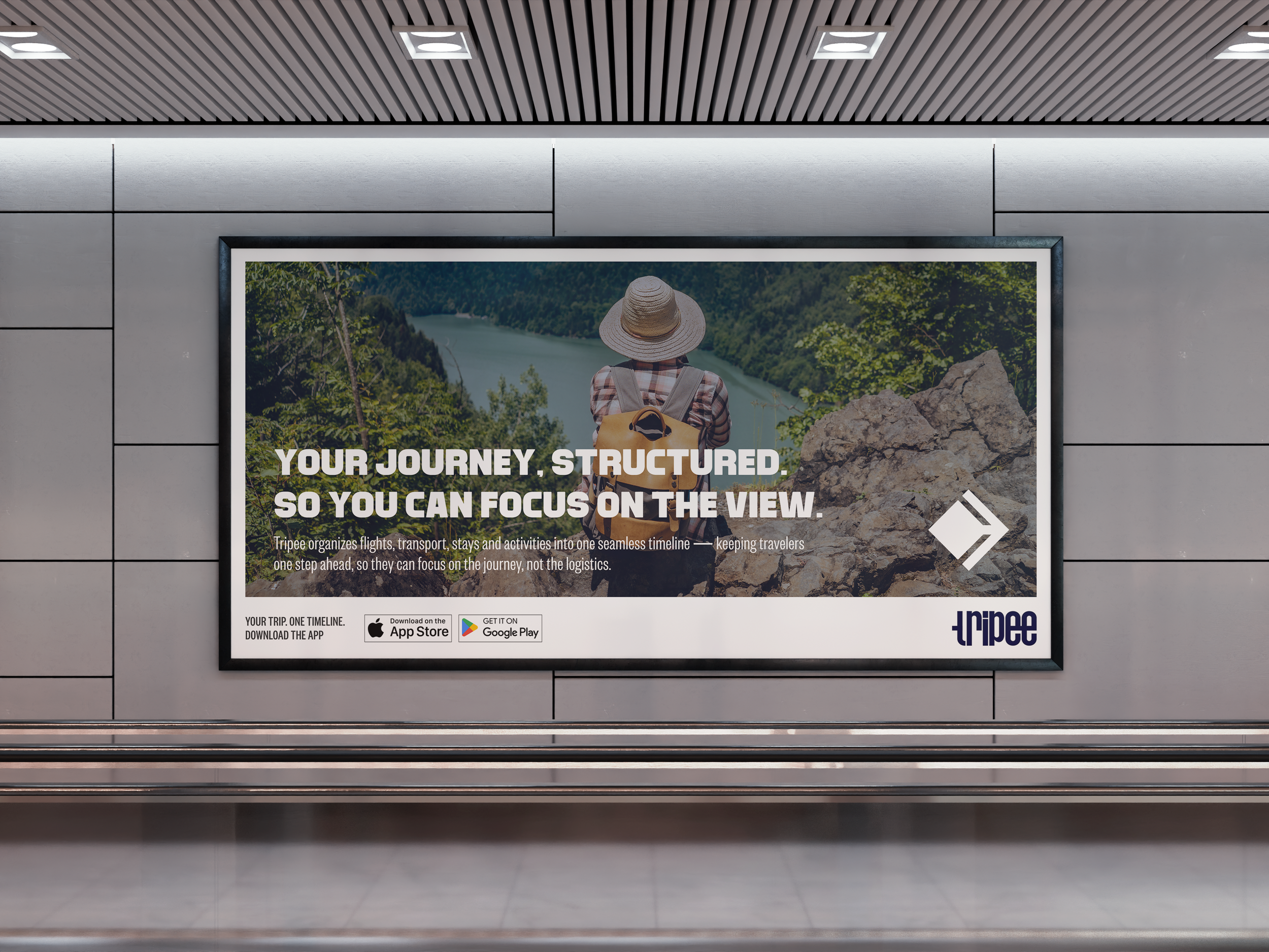
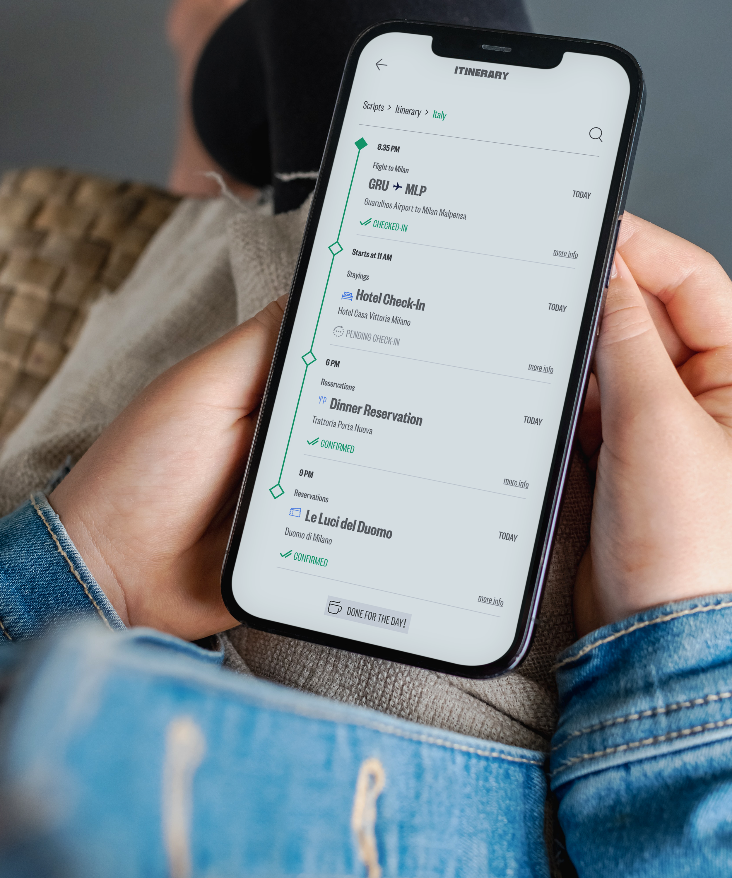
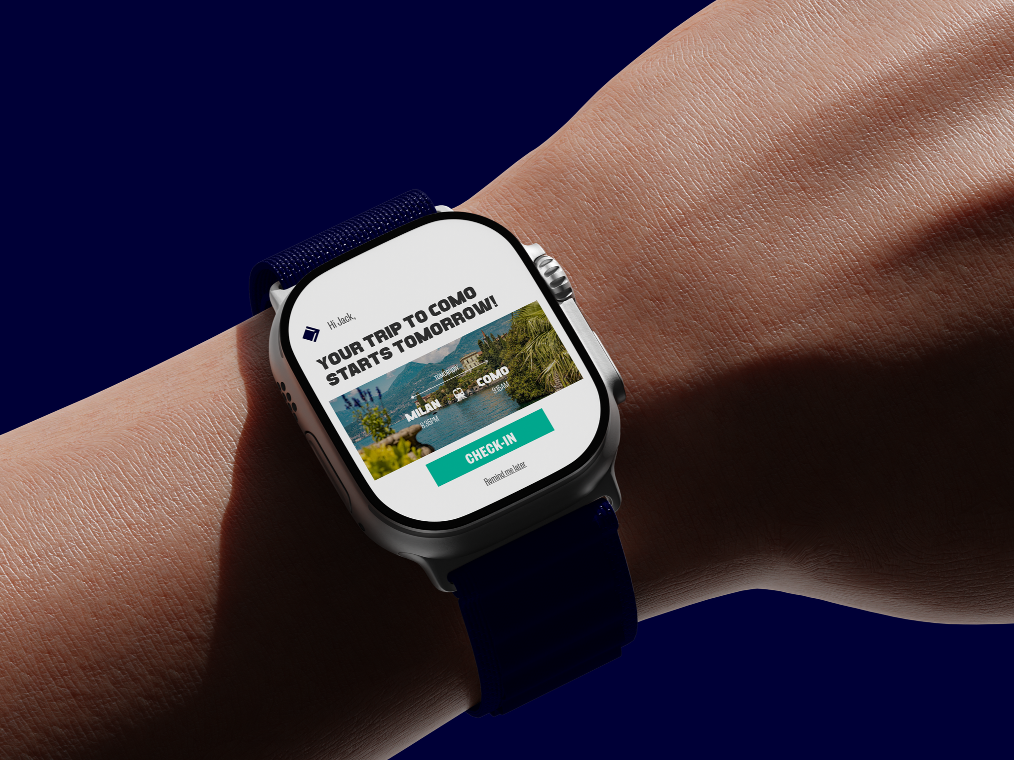
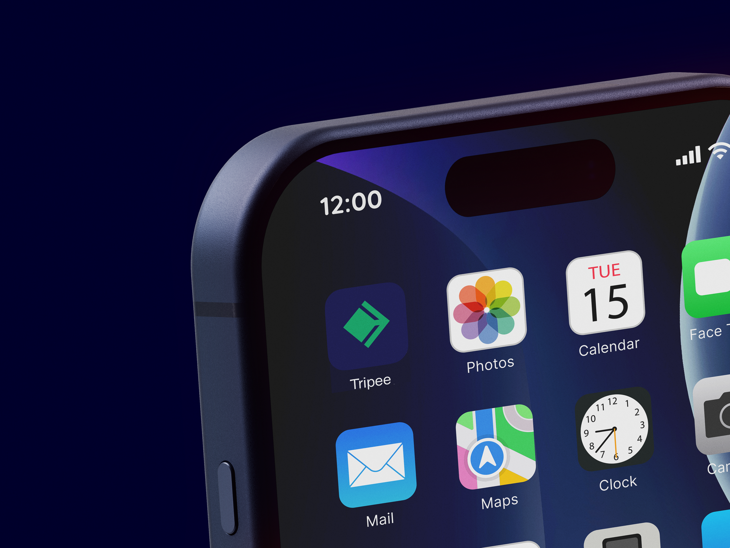
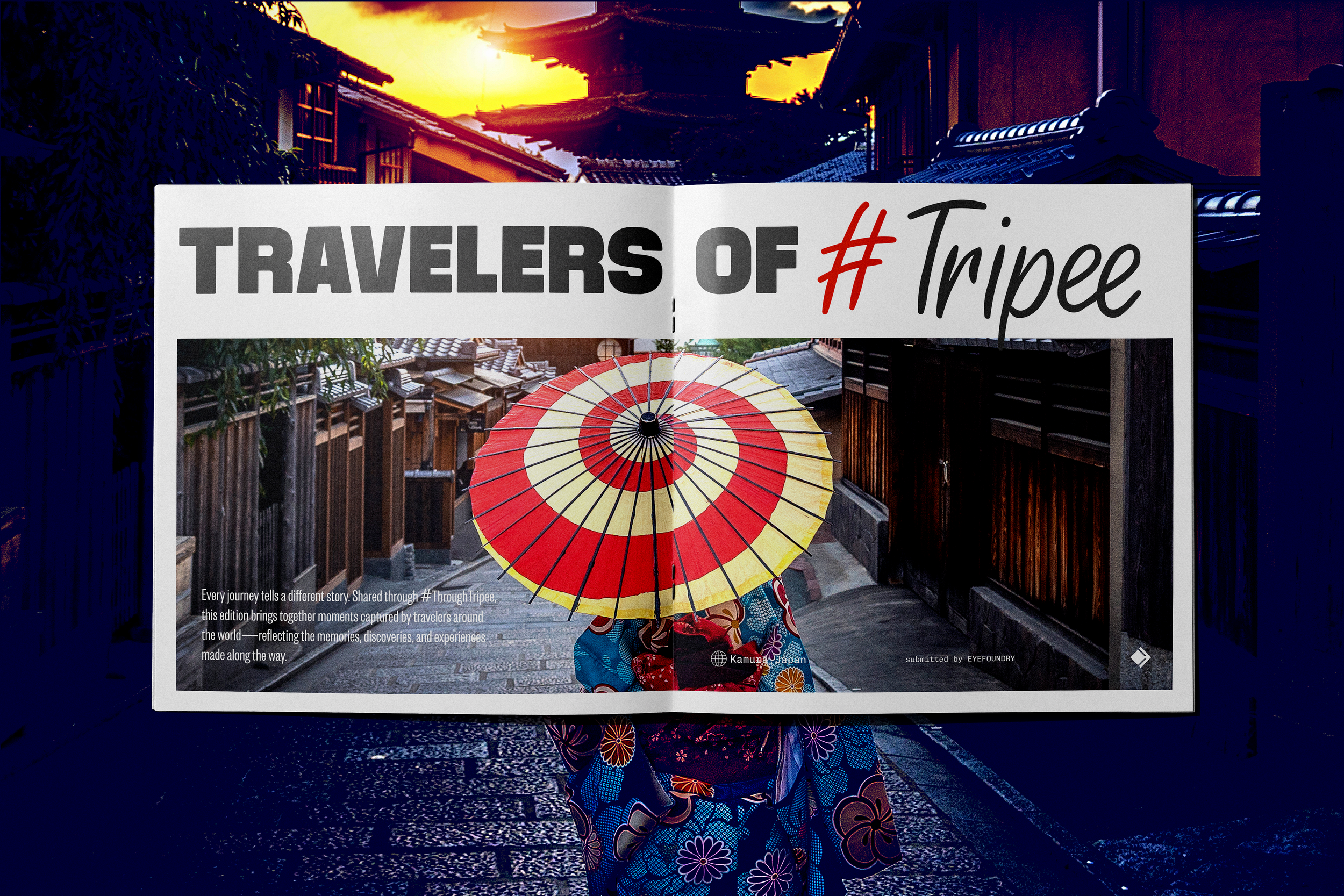
TRIPEE is a travel companion platform designed to explore how fragmented travel experiences can be transformed into more structured, intuitive and connected digital journeys.
Instead of forcing users to navigate scattered confirmations, disconnected booking systems, transportation apps and isolated reminders, the platform organizes every stage of travel into a unified timeline-based experience.
Built around the idea that travel is a sequence of connected moments rather than isolated transactions, TRIPEE reimagines organization as an integrated part of the travel experience itself.
Challenge
Modern travel experiences are often fragmented across multiple platforms, creating unnecessary stress, cognitive overload and uncertainty throughout the user journey. Travelers are expected to manually manage confirmations, itineraries, transportation details and reminders across disconnected systems that rarely communicate with one another.

Strategic Direction
TRIPEE was created to explore how digital organization and systems thinking could transform travel into a more seamless and emotionally reassuring experience. Built around the principles of flow over interruption, clarity over fragmentation and guidance over complexity, the platform was designed to feel continuously supportive throughout every stage of the journey.
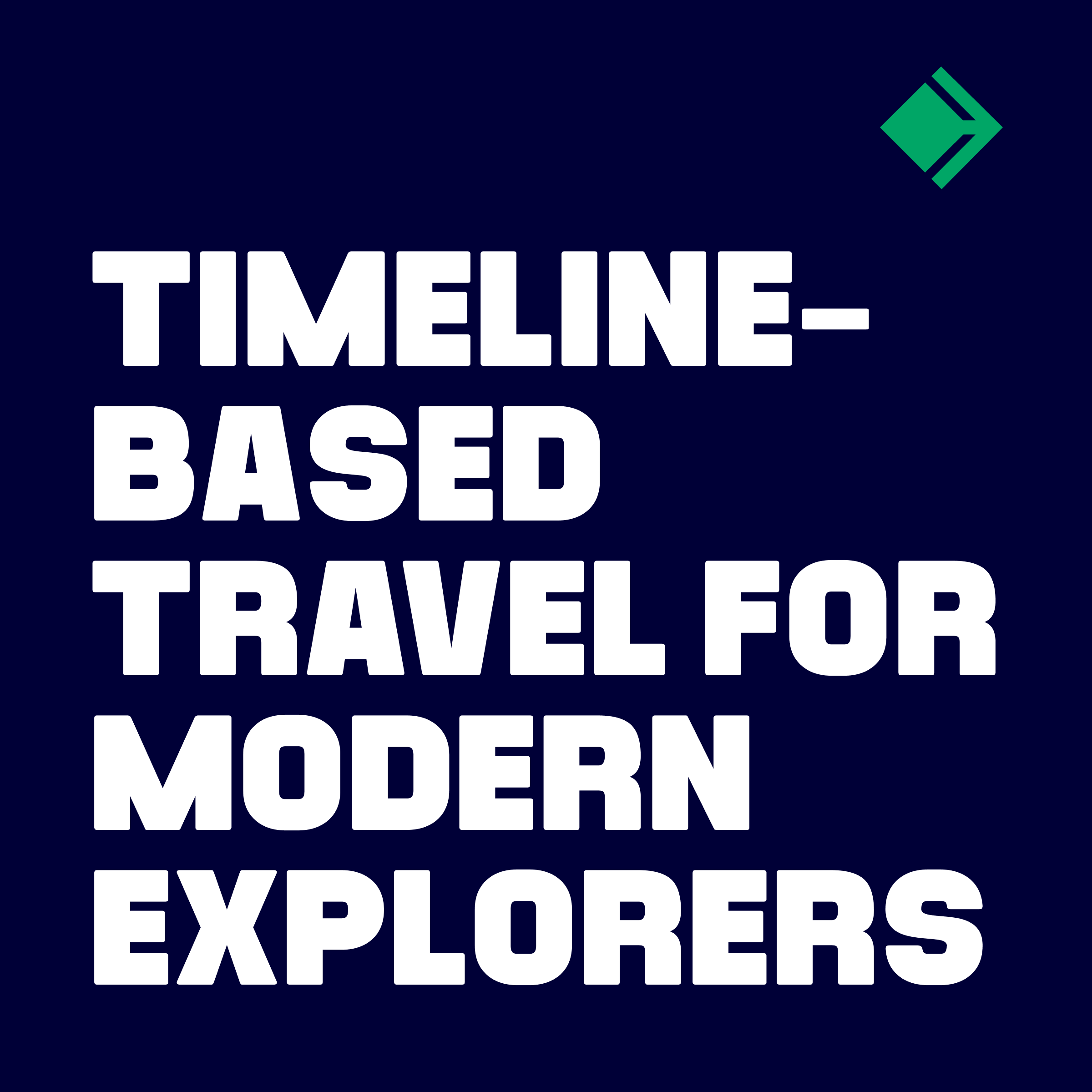
Travel naturally unfolds step by step
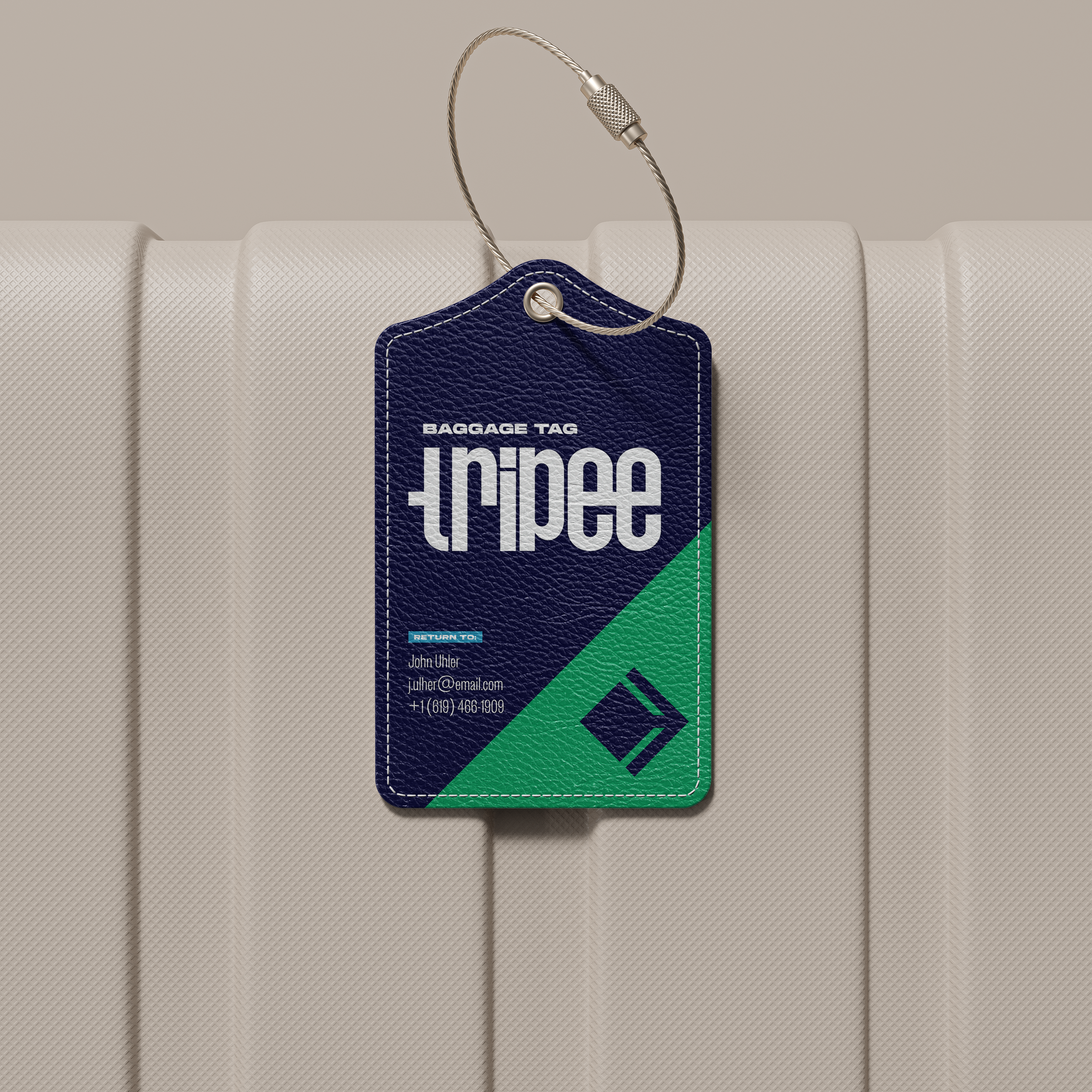
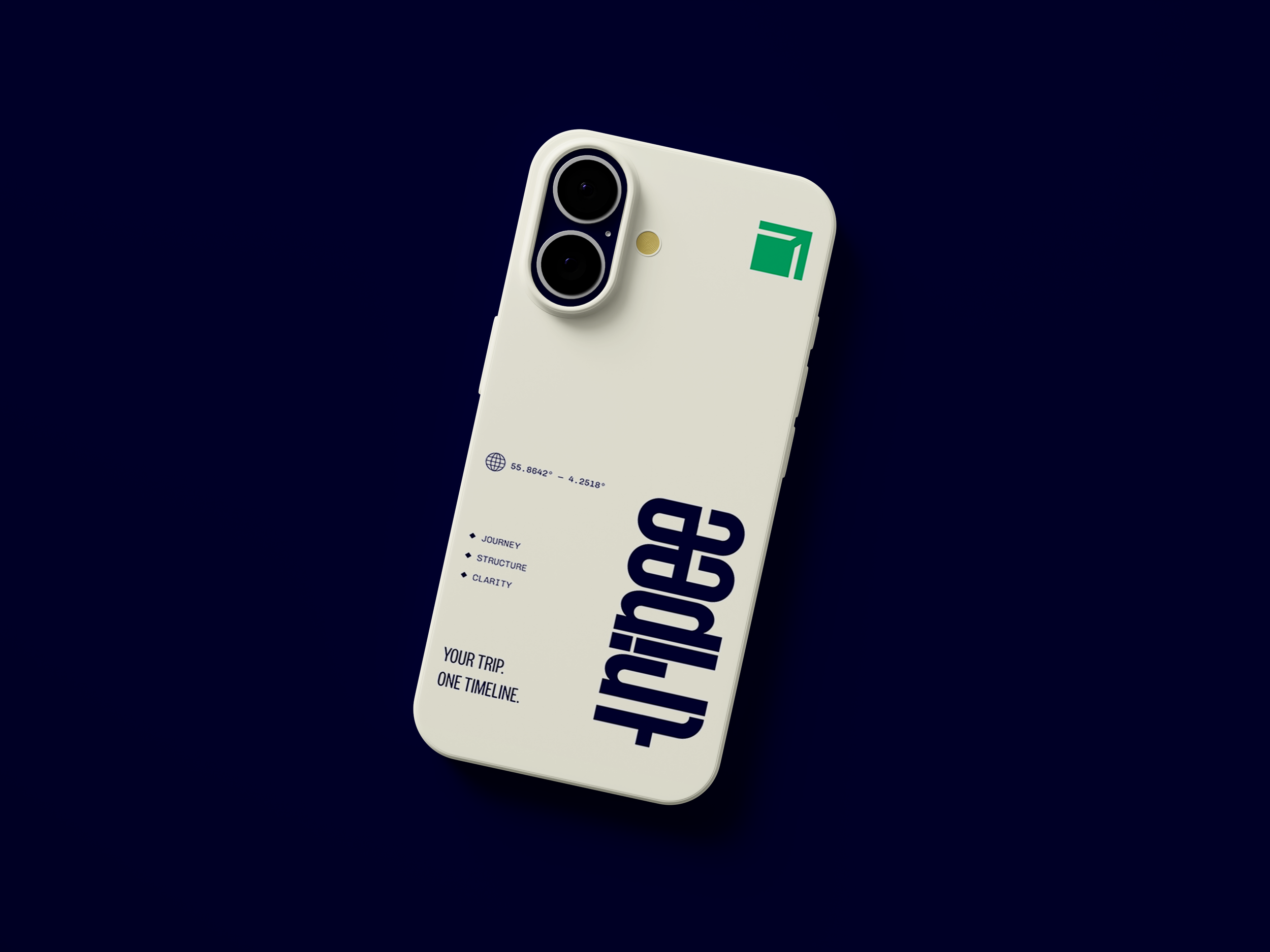
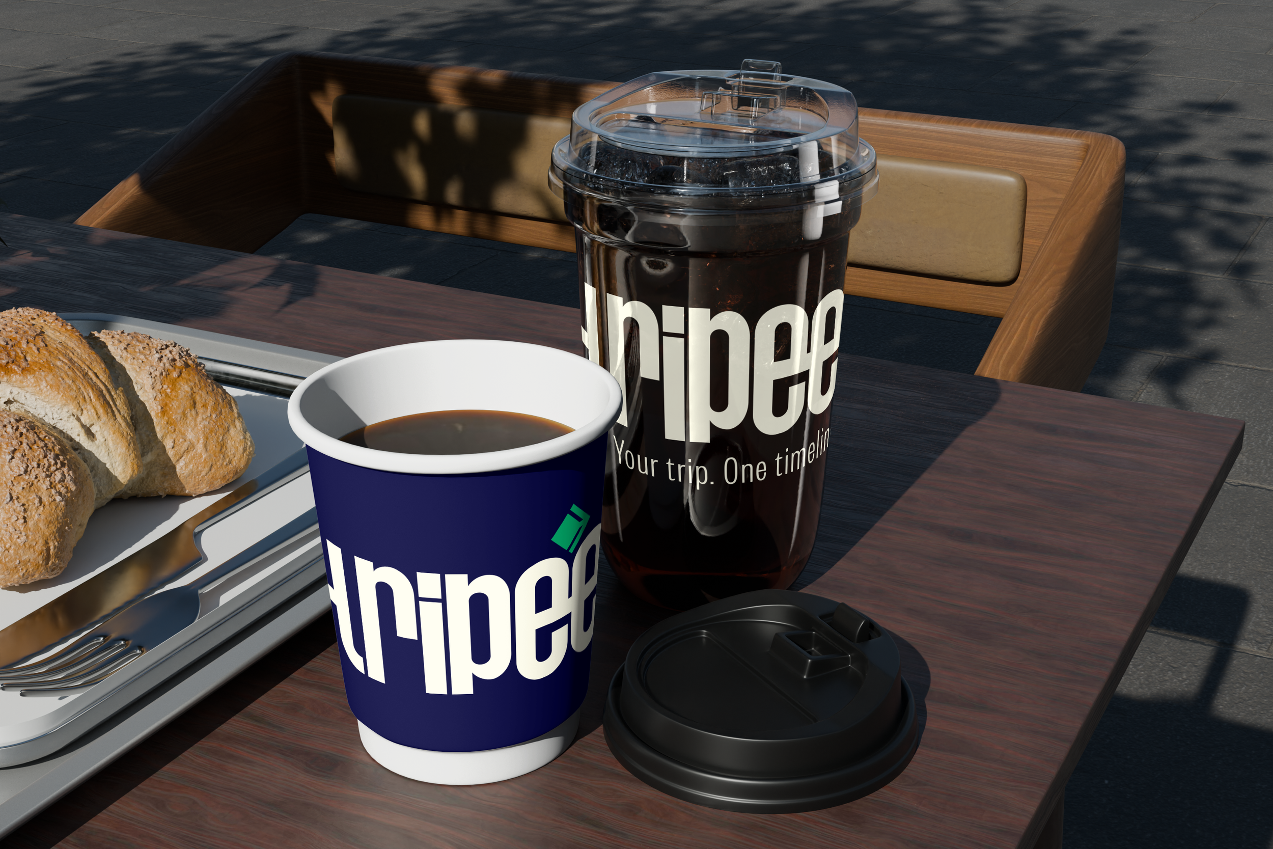
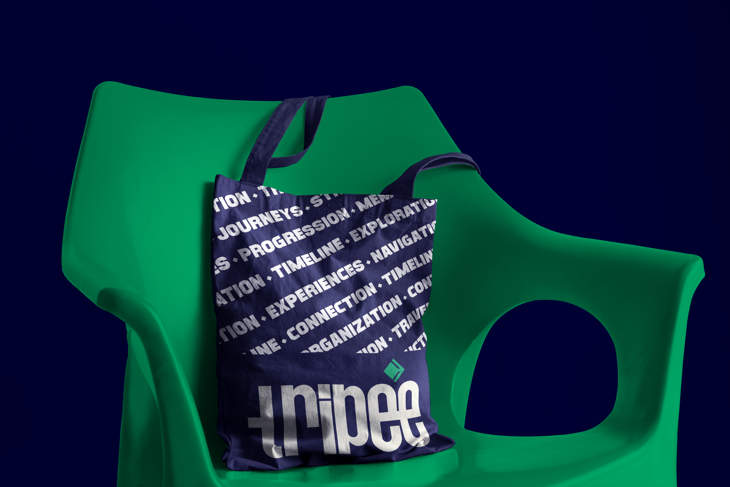
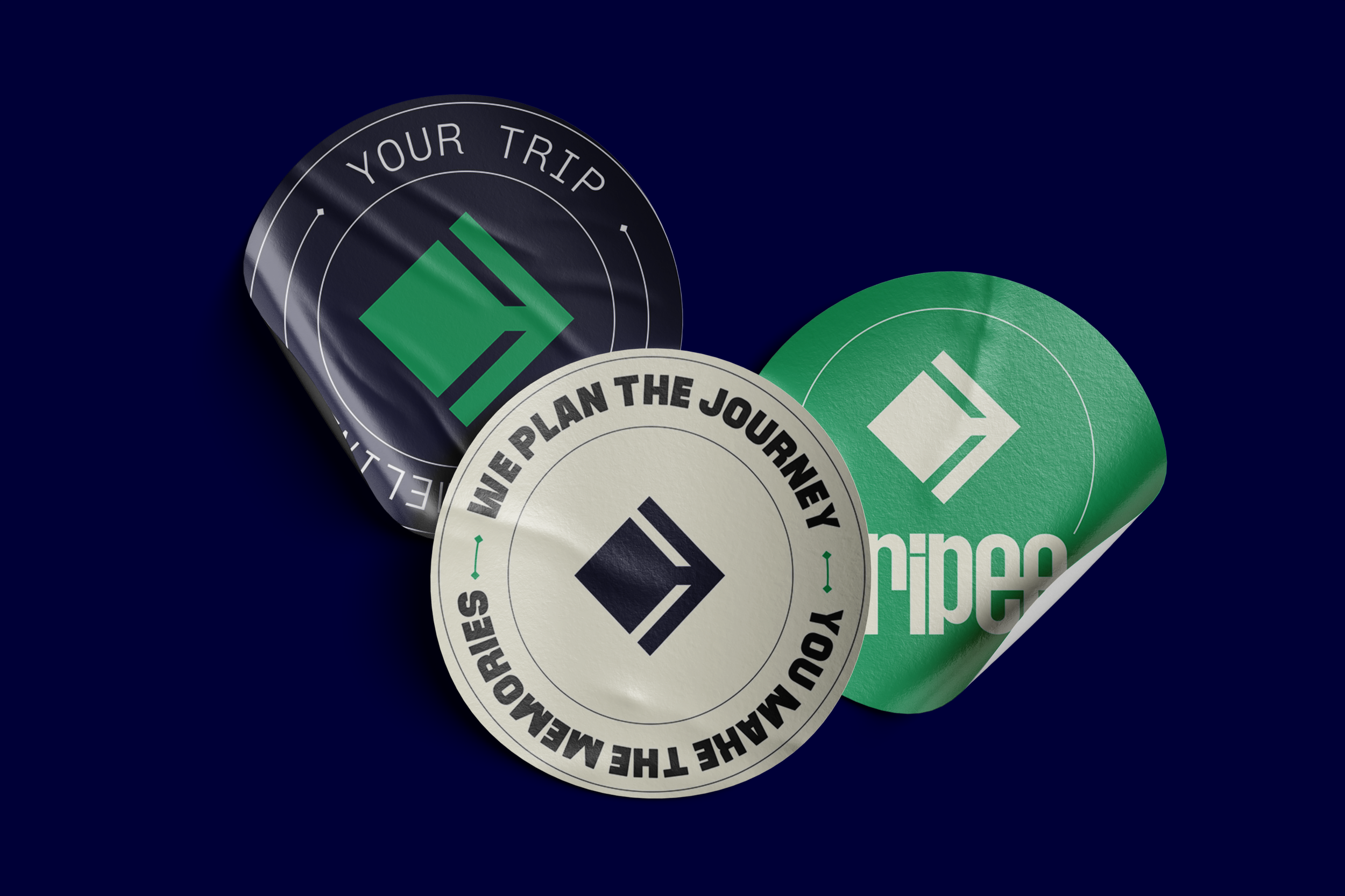
The identity system is built around the visual language of progression. Inspired by timelines, movement paths, directional systems, and connected travel moments, the logo symbol acts as both a route and a guide. Rather than relying on traditional travel clichés such as airplanes or map pins, the identity embraces a more modern and system-driven approach. This positions Tripee as a smart travel platform rather than a conventional tourism brand.

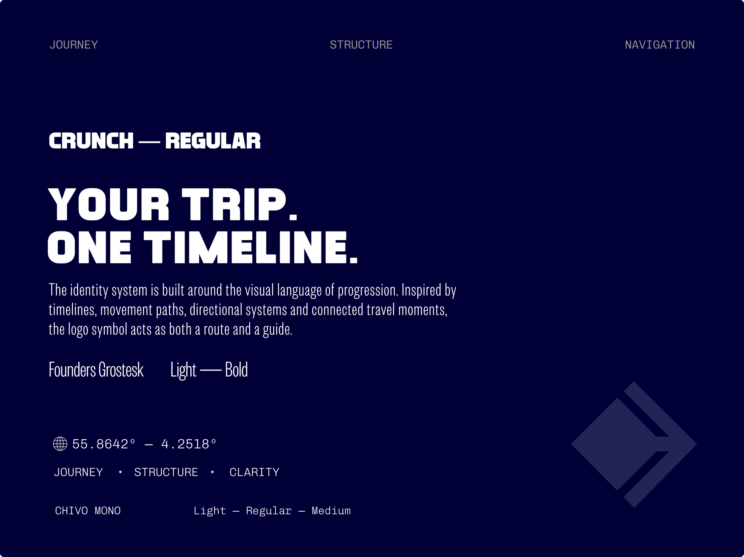
The addition of nodes across the symbol reinforces the concept of milestones within a journey, turning the icon into a visual timeline rather than a static mark. Each point represents a stage of travel—departure, transit, arrival, and experience—creating a direct connection between the identity and the product itself.
The result is a mark that feels directional, progressive and highly scalable across both digital and physical touchpoints.


TRIPEE was designed for digitally connected travelers seeking greater organization, clarity, and confidence throughout their journeys. The platform targets users who value streamlined planning, connected experiences, proactive organization, and low-friction travel interactions that reduce complexity and create a greater sense of control while traveling.

The brand strategy focused on positioning travel organization as a form of guidance rather than administration, reframing structure and planning as an integrated part of the travel experience itself. Built around the principles of clarity over fragmentation, flow over interruption, and guidance over complexity, the positioning informed a system designed to feel structured, responsive, and continuously supportive throughout every stage of the journey.

TRIPEE became an exploration of how systems thinking, digital organization, and experience design can improve emotionally complex user journeys like travel.
The project reinforced the importance of reducing cognitive load through connected interaction systems and clear information architecture. It also demonstrated how strategic brand thinking and digital product design can work together to transform utility-focused platforms into more engaging and emotionally supportive experiences.
other projects
Omum — Mental Health Through Frequency & Color
brand & marketing
Finera — Talk With Your Money
brand, web & socials

Moove — Fitness & Community for the 50+ Generation
brand, web & socials